

SearchBar
Search field with a clear button, a Cancel button and a panel of results.
A text field for querying a list, with the two controls a search needs and an ordinary field does not: a clear button inside the field, and a Cancel button beside it.
Give it children and it draws the results too — a panel welded to the field, opening upward by default so the list does not land under the keyboard. With no children it is the field alone, and you render the results yourself.
Installation
SearchBar ships with the library — no separate install.
import { SearchBar, Text, PlusIcon, Avatar, CheckIcon } from 'panelui-native';
import { View, Pressable } from 'react-native';
Or copy the source into your project, to own and edit it:
npx panelui-cli@latest add search-barUsage
<SearchBar placeholder="Search orders" onSubmit={run} />

<SearchBar
  avoidKeyboard
  cancel="focus"
  placeholder="Search or enter company"
  value={query}
  onChangeText={setQuery}
>
  <SearchBar.Section label="Results">
    {results.map((company) => (
      <SearchBar.Item key={company} onPress={() => add(company)}>
        {company}
      </SearchBar.Item>
    ))}
  </SearchBar.Section>
</SearchBar>
Composition
<SearchBar avoidKeyboard tokens={picked.map(…)}>
  <SearchBar.Token onRemove={…}>Claude</SearchBar.Token>   {/* inside the field */}
  <SearchBar.Section label="Suggested">   {/* a labelled run of rows */}
    <SearchBar.Item trailing={<SearchBar.Action …/>}>…</SearchBar.Item>
  </SearchBar.Section>
  <SearchBar.Status loading>Searching …</SearchBar.Status>   {/* instead of rows */}
</SearchBar>SearchBar.Section— A labelled run of rows — "Suggested", "Results". The label is announced as a header, so a screen reader reaching the group is told what it is before walking into it.SearchBar.Item— One result.leadingandtrailingare slots rather than built-in controls, because what a result row offers differs per search: an add, a pin, a count, nothing.SearchBar.Action— A button inside a row — an add, a pin, a remove — forItem'strailingslot. Use it rather than a plainPressable: a control nested inside a row takes the touch itself, so the row never sees the press and cannot hold the field's focus on the button's behalf. Without that, the press lands and the panel it was drawn in closes underneath it.SearchBar.Token— One choice already made, drawn inside the field before the caret. PassonRemovefor the ✕; without it the chip is a label. Tokens go to the root'stokensprop, not into the panel.SearchBar.Status— The one line a panel shows instead of rows. Use it for all three of nothing typed yet, a search in flight, and a query that matched nothing — those states look identical when the panel is simply blank, and which one it is decides what the person does next.
Examples
Results above the keyboard
avoidKeyboard lifts the field until it sits keyboardOffset points clear of the keyboard, and the panel opens upward into the space that is left. Both are needed together: a panel that opens downward from a field that has not moved is a panel behind the keyboard.
<SearchBar
  avoidKeyboard
  variant="filled"
  cancel="focus"
  placeholder="Search or enter company"
  value={query}
  onChangeText={setQuery}
>
  <SearchBar.Section label="Suggested">
    {COMPANIES.map((company) => (
      <SearchBar.Item
        key={company}
        trailing={
          <Pressable hitSlop={12} onPress={() => add(company)}>
            <PlusIcon size={18} />
          </Pressable>
        }
        onPress={() => add(company)}
      >
        {company}
      </SearchBar.Item>
    ))}
  </SearchBar.Section>
</SearchBar>
The states a panel has instead of rows
Three of them, and they are not interchangeable: nothing has been typed, the search is running, or it finished and matched nothing. SearchBar.Status says which, and takes a spinner for the middle one.
<SearchBar avoidKeyboard value={query} onChangeText={setQuery}>
  {query.length === 0 ? (
    <SearchBar.Status>Start typing to search companies</SearchBar.Status>
  ) : pending ? (
    <SearchBar.Status loading>Searching …</SearchBar.Status>
  ) : results.length === 0 ? (
    <SearchBar.Status>No companies found</SearchBar.Status>
  ) : (
    <SearchBar.Section label="Results">
      {results.map((name) => (
        <SearchBar.Item key={name}>{name}</SearchBar.Item>
      ))}
    </SearchBar.Section>
  )}
</SearchBar>
Filtering a list
The field is controlled, so onChangeText fires on every keystroke and the list narrows as fast as the typing does. Use this shape when the data is already in memory and you would rather show it on the page than in a panel.
const [query, setQuery] = useState('');
const results = PRODUCTS.filter((item) =>
  item.toLowerCase().includes(query.trim().toLowerCase())
);

return (
  <View className="w-full gap-4">
    <SearchBar
      placeholder="Search products"
      value={query}
      onChangeText={setQuery}
    />
    {results.map((item) => (
      <Text key={item} size="sm">{item}</Text>
    ))}
  </View>
);
Cancel on focus
cancel="focus" slides a Cancel button in while the field is being edited and folds it away again once it is not, so the row is only as wide as the search when nobody is searching. Pressing it empties the query, drops focus and calls onCancel.
<SearchBar
  variant="filled"
  shape="pill"
  cancel="focus"
  placeholder="Search messages"
  value={query}
  onChangeText={setQuery}
  onCancel={() => setSearching(false)}
/>
A query that costs something
debounce holds onDebouncedChange until typing pauses, so a network search runs once per pause instead of once per letter. onChangeText still fires on every keystroke — a controlled field that lags its own input is unusable. Pressing the return key flushes the pause immediately.
<SearchBar
  placeholder="Search the catalogue"
  debounce={400}
  loading={pending}
  value={query}
  onChangeText={setQuery}
  onDebouncedChange={(next) => search(next)}
/>
Sizes and shapes
shape="pill" is the shape a search field takes when it is chrome — above a list, in a header. rounded is the one it takes inside a form beside other fields.
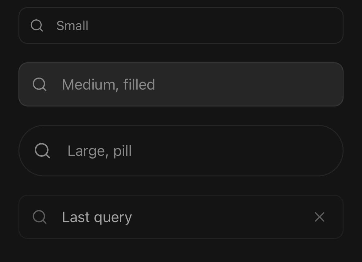
<View className="w-full gap-5">
  <SearchBar size="sm" placeholder="Small" />
  <SearchBar size="md" variant="filled" placeholder="Medium, filled" />
  <SearchBar size="lg" shape="pill" placeholder="Large, pill" />
  <SearchBar placeholder="Disabled" defaultValue="Last query" disabled />
</View>
Versions
Above the keyboard
The field lifts clear of the keyboard on focus and the results open upward out of it. Adding a company from a row leaves the keyboard up, so the next search starts where the last one ended.
<View className="flex-1 justify-end px-5">
  <ScrollView>{/* what has been picked so far */}</ScrollView>

  <SearchBar
    avoidKeyboard
    variant="filled"
    placeholder="Search or enter company"
    debounce={400}
    loading={pending}
    value={query}
    onChangeText={setQuery}
    onDebouncedChange={setRan}
  >
    <SearchBar.Section label="Results">
      {results.map((company) => (
        <SearchBar.Item
          key={company.name}
          leading={<Avatar size="sm" fallback={company.name[0]} />}
          trailing={
            <SearchBar.Action
              accessibilityLabel={`Add ${company.name}`}
              onPress={() => add(company.name)}
            >
              <PlusIcon size={18} />
            </SearchBar.Action>
          }
          selected={picked.includes(company.name)}
          onPress={() => add(company.name)}
        >
          {company.name}
        </SearchBar.Item>
      ))}
    </SearchBar.Section>
  </SearchBar>
</View>
Tap to add
No button on the row. The row is the button, and a tick replaces it once the result is in the stack.
Reach for this shape when adding is the only thing a result can do: a row carrying one button gives one action two targets, and the smaller of the two is the one people miss.
panelMaxHeight is here because every company matches an empty query. Left at the default the panel opens at its full height and covers the page it is searching.
<SearchBar
  avoidKeyboard
  variant="filled"
  placeholder="Search or enter company"
  panelMaxHeight={248}
  value={query}
  onChangeText={setQuery}
>
  <SearchBar.Section label="Results">
    {results.map((company) => (
      <SearchBar.Item
        key={company.name}
        leading={<Avatar size="sm" fallback={company.name[0]} />}
        trailing={picked.includes(company.name) ? <CheckIcon size={18} /> : undefined}
        selected={picked.includes(company.name)}
        onPress={() => toggle(company.name)}
      >
        {company.name}
      </SearchBar.Item>
    ))}
  </SearchBar.Section>
</SearchBar>
Names in the field
Picks become chips inside the field, before the caret, so the query and what it has produced are one control rather than a control and a list somewhere above it.
They scroll rather than wrap, because the field is one line tall and a row of chips allowed to grow it would move the caret every time something was picked. onRemoveLastToken fires on backspace in an empty field.
<SearchBar
  avoidKeyboard
  variant="filled"
  placeholder={picked.length ? 'Add another' : 'Search or enter company'}
  value={query}
  onChangeText={setQuery}
  onRemoveLastToken={() => setPicked((current) => current.slice(0, -1))}
  tokens={picked.map((name) => (
    <SearchBar.Token
      key={name}
      leading={<Avatar size="sm" className="h-5 w-5" fallback={name[0]} />}
      onRemove={() => remove(name)}
    >
      {name}
    </SearchBar.Token>
  ))}
>
  <SearchBar.Section label="Results">
    {results.map((company) => (
      <SearchBar.Item key={company.name} onPress={() => add(company.name)}>
        {company.name}
      </SearchBar.Item>
    ))}
  </SearchBar.Section>
</SearchBar>
Variants
size
smmd(default)lg
<SearchBar size="sm" placeholder="Search" />shape
rounded(default)pill
<SearchBar shape="pill" placeholder="Search" />attached
none(default)topbottom
<SearchBar attached="none">…</SearchBar>
<SearchBar attached="top">…</SearchBar>
<SearchBar attached="bottom">…</SearchBar>
API Reference
SearchBar
| Prop | Type | Default | Description |
|---|---|---|---|
variant | InputProps['variant'] | — | The field's background, from Input. outline draws its own edge, for a search bar sitting on the page; filled drops it, for one inside a card or a header where a second border reads as a seam. Defaults to outline. |
value | string | — | The query, when the caller holds it. Leave unset to let the field keep it. |
defaultValue | string | — | Starting query for an uncontrolled field. Ignored once value is passed. |
onChangeText | (value: string) => void | — | Fires on every keystroke. For a search that costs something, see debounce. |
onSubmit | (value: string) => void | — | The return key, which is labelled Search. Flushes onDebouncedChange first. |
debounce | number | 0 | How long typing has to pause before onDebouncedChange runs, in milliseconds. 0 runs it on every keystroke, which is only right for a filter over a list already in memory. |
onDebouncedChange | (value: string) => void | — | The query, once typing has paused for debounce milliseconds. |
onClear | () => void | — | Fires after the ✕ empties the field. The field keeps focus. |
onCancel | () => void | — | Fires after Cancel empties the field and drops focus. |
isClearable | boolean | true | Whether the ✕ appears once there is a query. |
cancel | 'never' | 'focus' | 'always' | 'never' | When the Cancel button is beside the field. focus slides it in while the field is being edited and away again when it is not, which is what a search bar above a list wants. always keeps it out, for a screen that is nothing but the search. |
cancelLabel | string | 'Cancel' | The Cancel button's word. |
clearLabel | string | 'Clear search' | How the ✕ announces itself. |
loading | boolean | false | Results are on their way. A spinner takes the ✕'s place, because the two would otherwise sit on top of one another at exactly the moment a query is both non-empty and running. |
icon | ReactNode | — | The leading glyph, for a search over something with a symbol of its own. |
avoidKeyboard | boolean | false | Lift the whole search — field, Cancel button and panel — until it sits clear of the software keyboard, and put it back on blur. Without it the field stays where the page left it, which on most screens is behind the keyboard it just opened. Install react-native-keyboard-controller for this to behave on Android. Do not toggle it at runtime: it changes which component wraps the row, so the field would remount and lose focus. |
keyboardOffset | number | 12 | Gap kept between the field's bottom edge and the keyboard. |
panel | SearchBarPanelMode | 'focus' | When the results panel is shown. focus opens it while the field is being typed into, always keeps it out for a screen that is nothing but the search, never ignores the children entirely. |
panelPlacement | SearchBarPanelPlacement | 'top' | Which side of the field the panel opens out of. top is the default, because the space under a focused field belongs to the keyboard. |
panelMaxHeight | number | — | Cap on the panel's height, in points. The panel takes the smaller of this and the room between the field and the edge of the screen, so it never runs off the top of the display. Unset, it is capped at about six rows: the space above a lifted field is most of the screen, and a panel that takes all of it stops reading as something laid over the app. Longer lists scroll. |
tokens | ReactNode | — | What has been picked so far, drawn inside the field before the caret. SearchBar.Token is the chip; anything else that fits on one line works too. Tokens scroll rather than wrap, so the field stays one line tall. |
onRemoveLastToken | () => void | — | Fires when backspace is pressed in an empty field. Remove the last token here — it is the gesture every token field answers, and without it the only way back out of a choice is its own ✕. |
SearchBar.Section
| Prop | Type | Default | Description |
|---|---|---|---|
className | string | — | |
label | string | — | The heading over the run of rows — "Suggested", "Results". Announced as a header, so a screen reader reaching the group is told what it is before walking into it. |
SearchBar.Item
| Prop | Type | Default | Description |
|---|---|---|---|
className | string | — | |
leading | ReactNode | — | Anything before the label — an avatar, a logo, a status dot. |
trailing | ReactNode | — | Anything after it. A slot rather than a built-in button, because what a result row offers differs per search: an add, a pin, a count, nothing. |
description | string | — | A second line under the label, for what the label alone cannot say. |
selected | boolean | — | Draws the row as the one the search has settled on. |
SearchBar.Status
| Prop | Type | Default | Description |
|---|---|---|---|
className | string | — | |
loading | boolean | false | A spinner beside the line, for a search that is still running. |
SearchBar.Action
| Prop | Type | Default | Description |
|---|---|---|---|
className | string | — |
SearchBar.Token
| Prop | Type | Default | Description |
|---|---|---|---|
className | string | — | |
leading | ReactNode | — | Anything before the label — an avatar, a logo, a status dot. |
onRemove | () => void | — | Fires when the chip's ✕ is pressed. Without it no ✕ is drawn. |
removeLabel | string | — | How the ✕ announces itself. Defaults to Remove <label>. |
Every part also accepts the underlying React Native props (ViewProps or TextProps) and a className for Tailwind utilities.
Notes
Where the panel opens, and why
The panel is welded to one edge of the field: panelPlacement="top", the default, puts it above, and "bottom" below. Above is the default because the space under a focused field belongs to the keyboard, and it also puts the first result nearest the caret.
It is positioned absolutely rather than laid out in the flow, so opening it never moves the page underneath — a list that pushes the field it belongs to is a field that walks away from the finger typing into it. Its height is capped by the room it actually has between the field and the edge of the screen; pass panelMaxHeight to cap it lower.
Touches inside the panel
Nothing pressed inside the panel closes the search. The panel keeps the keyboard through every tap, including the ones that land on padding, on the gap between two rows, on a section heading, or on SearchBar.Status — a search that ended because somebody tapped the word "Searching …" is a search that ended for no reason.
A press also holds the field's focus open for a moment afterwards. That covers the other way a touch can end a search: a control inside a row takes focus with the press on Android, and the field's blur closes the panel that control is standing in before the press has finished being served.
That second half only works for controls that go through the component. Use SearchBar.Action for a button in a row's trailing slot rather than a plain Pressable — the row cannot hold focus on behalf of something nested inside it, because the nested control takes the touch and the row never sees it.
What has already been picked
tokens puts the choices made so far inside the field, before the caret, so the query and what it has produced are one control. SearchBar.Token is the chip; onRemove gives it a ✕.
They scroll rather than wrap, and take at most 60% of the field's width. The field is one line tall, and a row of chips allowed to grow it would move the caret every time something was picked.
onRemoveLastToken fires on backspace in an empty field — the gesture a token field answers everywhere else. It only fires when the field is empty: while there is a query, backspace is editing it.
panel="focus" shows it while the field is being typed into, "always" for a screen that is nothing but the search, and "never" ignores the children entirely.
Getting clear of the keyboard
avoidKeyboard moves the field, the Cancel button and the panel together, and only while this field is the one being edited. Install react-native-keyboard-controller for it to behave on Android — see useKeyboardAvoidance.
Do not toggle it at runtime. It changes which component wraps the row, so the field would remount and lose focus mid-search.
The rest
When disabled, the field, clear button, Cancel button, panel and submit boundary are all inert. Cancel remains visible when cancel="always", but leaves the focus order and cannot clear, blur, or call onCancel.
The clear button is drawn by the component rather than left to the platform's clearButtonMode, which exists on iOS only, cannot be labelled for a screen reader and cannot be swapped for a spinner. Clearing keeps the keyboard up, because emptying a query is usually the start of the next one; Cancel is the control that ends the search.
The glyph is 24 points and its touch box is 48, made up with slop rather than with size — a 48-point circle inside a 40-point field would either overflow it or force every search bar in the app to be as tall as the largest one.
loading replaces the clear button rather than joining it, since the two would otherwise collide at exactly the moment a query is both non-empty and running.
For a search with a label, a description and an error line, use Field around an Input. SearchBar drops that furniture on purpose: Cancel sits beside the field, and a label stacked above the field would leave it centred against the whole stack.
For a field that picks one value out of a list rather than running a search, use Combobox.
Submitting cancels any pending debounce timer before immediately delivering the current query, so onDebouncedChange runs once for that submission rather than once now and again when the old pause expires. Non-positive or non-finite debounce values use the immediate path and never allocate a timer.
Public exports
Values: SearchBar
Types: SearchBarProps, SearchBarActionProps, SearchBarItemProps, SearchBarSectionProps, SearchBarStatusProps, SearchBarTokenProps, SearchBarPanelMode, SearchBarPanelPlacement