

Popover
Panel anchored to the element that opened it.
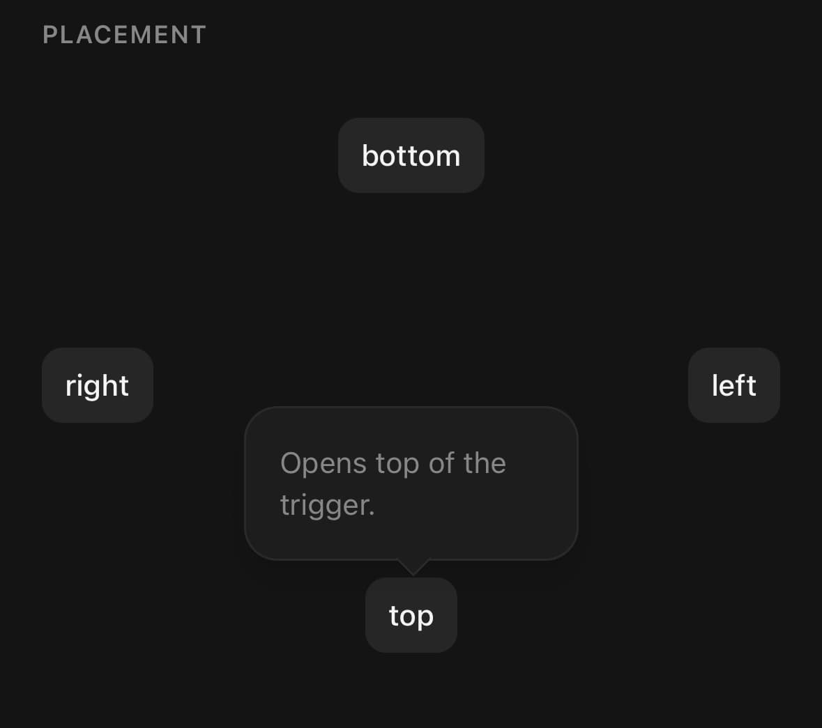
A panel anchored to the thing that opened it.
Use it when the context around the trigger has to stay visible. A Dialog takes the screen and asks to be dealt with; a popover stays beside its trigger.
Placement is a preference, not a promise. The trigger is measured in window coordinates when it is pressed, the panel measures itself on its first layout, and the two are reconciled against the safe area — so placement="bottom" means below, if below fits, and a trigger near the bottom of the screen opens upwards instead of off the edge.
Installation
Popover ships with the library — no separate install.
import { Popover, Button, Input, Text, InfoIcon, ShareNodesIcon, Item, MessageCircleIcon, ListIcon } from 'panelui-native';Or copy the source into your project, to own and edit it:
npx panelui-cli@latest add popoverUsage
<Popover>
  <Popover.Trigger>
    <Button variant="outline">Options</Button>
  </Popover.Trigger>
  <Popover.Content placement="bottom" align="end">
    <Popover.Title>Export</Popover.Title>
    <Popover.Description>Choose a format.</Popover.Description>
  </Popover.Content>
</Popover>
Composition
<Popover>
  <Popover.Trigger>…</Popover.Trigger>
  <Popover.Content>
    <Popover.Arrow />
    <Popover.Title>…</Popover.Title>
    <Popover.Description>…</Popover.Description>
    <Popover.Close>…</Popover.Close>
  </Popover.Content>
</Popover>Popover.Trigger— Wraps a single child and toggles the popover on press. It is also what gets measured, so the panel knows where to sit.Popover.Content— The panel. Portaled above everything else, positioned against the trigger, and flipped or slid to stay inside the safe area.Popover.Arrow— Optional point towards the trigger. Follows the resolved side, so it stays correct after a flip.Popover.Title— Panel heading.Popover.Description— Muted supporting line.Popover.Close— Wraps a child and closes the popover on press.
Examples
A long panel, scrolled
The panel is capped to the room inside the safe area whatever you do, because a panel positioned past the edge of the screen cannot be scrolled back into view. maxHeight caps it lower than that, and scrollable hands the overflow back to the finger.
<Popover>
  <Popover.Trigger>
    <Button variant="outline">Release notes</Button>
  </Popover.Trigger>
  <Popover.Content scrollable maxHeight={280} align="start" className="w-72">
    <Popover.Title>What changed</Popover.Title>
    {notes.map((note) => (
      <Popover.Description key={note.id}>{note.body}</Popover.Description>
    ))}
  </Popover.Content>
</Popover>
With an arrow
The arrow is a rotated square half-buried under the panel, so only the point shows. It needs the panel to keep its border for its own two visible edges to line up with.
<Popover>
  <Popover.Trigger>
    <Button variant="ghost" size="icon" accessibilityLabel="What is this?">
      <InfoIcon size={18} />
    </Button>
  </Popover.Trigger>
  <Popover.Content placement="top" className="w-60">
    <Popover.Arrow />
    <Popover.Title>Monthly active users</Popover.Title>
    <Popover.Description>
      Anyone who opened the app at least once in the last 30 days.
    </Popover.Description>
  </Popover.Content>
</Popover>
A form, matching the trigger width
width="trigger" locks the panel to the trigger, so the two read as one control rather than as a panel floating over a button. It only earns its keep when the trigger is wide — a form pinned to the width of a short outline button is squeezed into a column. Give the trigger fullWidth, and set minWidth as the floor for the day it turns out narrower than the content. Controlled here, because the form needs to close itself on save.
const [open, setOpen] = useState(false);
const [name, setName] = useState("Untitled board");

<Popover open={open} onOpenChange={setOpen}>
  <Popover.Trigger>
    <Button variant="outline" fullWidth>Rename board</Button>
  </Popover.Trigger>
  <Popover.Content
    width="trigger"
    minWidth={260}
    align="start"
    className="gap-3"
  >
    <Popover.Title>Rename</Popover.Title>
    <Input value={name} onChangeText={setName} accessibilityLabel="Board name" />
    <View className="flex-row justify-end gap-2">
      <Popover.Close>
        <Button variant="ghost" size="sm">Cancel</Button>
      </Popover.Close>
      <Popover.Close>
        <Button size="sm" onPress={save}>Save</Button>
      </Popover.Close>
    </View>
  </Popover.Content>
</Popover>
Nudging the alignment
align picks the edge to line up with; alignOffset moves the panel along that axis afterwards, and offset changes the gap to the trigger. Both take pixels and both accept negatives.
{/* Lined up with the trigger's left edge, pulled 8px further left. */}
<Popover.Content align="start" alignOffset={-8} />

{/* Tucked right up against the trigger. */}
<Popover.Content offset={2} />
A blurred background
A popover does not dim the screen by default. Pass blur to frost what is behind it instead — it uses expo-blur when installed and falls back to a dim when it is not, so it is safe to pass either way.
<Popover>
  <Popover.Trigger>
    <Button variant="outline">Frost the screen</Button>
  </Popover.Trigger>
  <Popover.Content blur align="start" className="w-64">
    <Popover.Arrow />
    <Popover.Title>Focus here</Popover.Title>
    <Popover.Description>The list behind is blurred.</Popover.Description>
  </Popover.Content>
</Popover>
Presented as a bottom sheet
Set presentation="bottom-sheet" on the root and the same content opens in a draggable sheet instead of an anchored panel — better for a form on a small screen. Placement, align and the arrow do not apply.
<Popover presentation="bottom-sheet">
  <Popover.Trigger>
    <Button variant="outline">Sort by</Button>
  </Popover.Trigger>
  <Popover.Content>
    <Popover.Title>Sort by</Popover.Title>
    {options.map((option) => (
      <Popover.Close key={option}>
        <Pressable onPress={() => sort(option)} className="rounded-xl px-3 py-3 active:bg-accent">
          <Text>{option}</Text>
        </Pressable>
      </Popover.Close>
    ))}
  </Popover.Content>
</Popover>
The platform's own popover
native hands the panel to SwiftUI. The platform draws the container, its corner radius, its shadow and its arrow, and keeps the anchored shape on a phone rather than adapting to a sheet.
Give the content a width: the platform sizes its popover to what is hosted in it, and a subtree with no width of its own has nothing to report. iOS only — Android and web keep the styled panel, so the same tree works everywhere.
<Popover native>
  <Popover.Trigger>
    <Button native glass size="icon" variant="ghost" accessibilityLabel="Filter">
      <ListIcon size={18} />
    </Button>
  </Popover.Trigger>
  <Popover.Content width={220} placement="bottom">
    <Popover.Close>
      <Item size="sm" onPress={() => setFilter('all')}>
        <Item.Media variant="icon">
          <MessageCircleIcon size={16} />
        </Item.Media>
        <Item.Content>
          <Item.Title>All chats</Item.Title>
        </Item.Content>
      </Item>
    </Popover.Close>
  </Popover.Content>
</Popover>
Owning the panel's surface
unstyled drops the panel's background, border, padding and shadow and keeps only its position and its size, so the surface can be drawn by the caller. background then takes a layer rendered behind the content and — importantly — outside the scroller, so a surface stays put while the content moves over it.
<Popover>
  <Popover.Trigger>
    <Button variant="outline">Open</Button>
  </Popover.Trigger>
  <Popover.Content
    unstyled
    scrollable
    className="p-3"
    background={<View className="absolute inset-0 bg-overlay" />}
  >
    <Text>Drawn on a surface of your own.</Text>
  </Popover.Content>
</Popover>
API Reference
Popover
| Prop | Type | Default | Description |
|---|---|---|---|
open | boolean | — | Controlled open state. |
onOpenChange | (open: boolean) => void | — | |
defaultOpen | boolean | false | Initial state when uncontrolled. |
presentation | PopoverPresentation | 'popover' | popover is the anchored panel. bottom-sheet presents the content in a draggable sheet instead — better on a small screen, or when the content is a form rather than a menu. Placement, align and the arrow do not apply to a sheet. |
native | boolean | false | Present the platform's own popover instead of this one. Requires the optional @expo/ui. iOS only. SwiftUI has a popover that anchors to a view and keeps its anchored shape on a phone rather than becoming a sheet; Compose's nearest relative is a dropdown menu, which is a different control with different rules. Android and web keep the styled panel, as does an iOS device without @expo/ui installed. The platform draws the container, so theme tokens do not reach it. The panel's surface, its corner radius, its shadow and its arrow are the system's; className on Popover.Content styles what is inside it. align, offset, alignOffset, scrim and blur have no native equivalent and are ignored; placement becomes the edge the arrow is asked for. Give the content a width. The platform sizes its popover to what is hosted in it, and a React Native subtree with no width of its own has nothing to report — the same rule that governs every hosted view. Popover.Content defaults to a sensible one under native, but a panel whose rows need more room should say so. |
Popover.Content
| Prop | Type | Default | Description |
|---|---|---|---|
className | string | — | |
placement | PopoverPlacement | 'bottom' | Preferred side of the trigger. Flipped when that side does not fit. |
align | PopoverAlign | 'center' | Where the panel sits along the trigger's other axis. |
offset | number | 8 | Gap between the trigger and the panel, in pixels. |
alignOffset | number | 0 | Nudge along the alignment axis, in pixels. |
width | number | 'trigger' | 'full' | 'content-fit' | 'content-fit' | content-fit sizes to the content, trigger matches the trigger's width, full spans the safe area, and a number is that many pixels. |
minWidth | number | — | Floor for the panel's width, in pixels. Worth setting with width="trigger", where a narrow trigger would otherwise squeeze the content into a column. |
maxHeight | number | — | Ceiling for the panel's height, in pixels. Always clamped to the room inside the safe area, which is also the default — a panel is never positioned so that part of it falls off the screen, because the part that falls off cannot be scrolled back into view. |
scrollable | boolean | false | Scroll the panel's body when it is taller than maxHeight. Off by default, because a popover is usually a paragraph or a short form and a scroller around either one only adds a bounce. Worth turning on for a list of unknown length, which is the case where the cap actually bites. The spacing between children moves to the scroller's content when this is set; className still dresses the panel itself. |
unstyled | boolean | false | Drop the panel's own surface — its background, border, radius, padding and shadow — and keep only its position and its size. For a caller that draws the surface itself, so that something can be put behind the content rather than layered on top of a background that is already painted. The panel is still clipped to a rounded rectangle, because a surface drawn inside it has to have something to be clipped by. |
background | ReactNode | — | A layer drawn inside the panel, behind its content — and, crucially, outside its scroller, so that a surface does not scroll away with the rows on top of it. Pair it with unstyled to own the panel's appearance. |
dismissible | boolean | true | Tap outside the panel closes it. Default true. |
blur | boolean | false | Frost the background behind the panel instead of dimming it. Uses expo-blur when installed and falls back to the dimmed scrim when it is not, so it is safe to pass either way. Someone who has Reduce Transparency switched on gets an opaque backdrop instead, which is the whole point of the setting. |
scrim | boolean | false | Dim the screen behind the panel. Off by default: a popover is a panel beside something, and dimming the page says the thing behind it has stopped being available — which is a dialog's claim, not a popover's. Worth turning on when the panel is the only thing that matters while it is up, which is what a menu opened on the content itself is. Ignored under blur, which draws its own dim. |
scrimClassName | string | 'bg-black/30' | The dim's classes, when scrim is set. |
Popover.Arrow
| Prop | Type | Default | Description |
|---|---|---|---|
className | string | — |
Every part also accepts the underlying React Native props (ViewProps or TextProps) and a className for Tailwind utilities.
Notes
Placement is resolved, not obeyed. The side is flipped only when the preferred one genuinely has less room than its opposite; after that the panel is slid along the other axis to stay inside the safe area. That order matters — sliding first would let a badly placed panel look like it fits.
The panel is measured before it is shown. Its size is not known until it has laid out once, so the first frame is laid out off-screen and the entrance starts from the frame after. That entrance is driven by hand rather than by a preset, because it has to start from whichever side was resolved — a panel that opened upwards should not appear to come from above.
The arrow points at the trigger, not the panel. When align shifts the panel off-centre or a clamp slides it back on screen, the arrow tracks the trigger's centre rather than the panel's middle.
The trigger is measured on every open, not once on layout. A trigger inside a scroll view has moved since it was laid out, and a stale rectangle anchors the panel to where it used to be.
Popover.Trigger wraps its child in a view. The ref has to survive whatever the child is — a Button, a Pressable, an icon — and only a wrapper the component owns is guaranteed to be measurable.
Use a BottomSheet instead when the content is long, needs its own scroll, or is the whole point of the interaction. A popover that fills the screen is a dialog wearing the wrong clothes.
Sizing the panel
content-fit is the default and right for a menu. trigger ties the panel to the control that opened it, which reads as one thing rather than two — but only when the trigger is wide enough to hold what goes inside. minWidth is the floor, and it never wins past the space that actually exists: a panel wider than the screen is worse than a cramped one.
A panel is never taller than the screen. place slides the panel to keep it inside the safe area, but a panel taller than that area has nowhere to slide to — it ends up pinned to the top edge with the rest of it off the bottom, where there is no way to get at it. The height is capped first so the slide always has a solution, and scrollable makes the overflow reachable.
A column of actions is a Menu. A popover will hold one, but the rows then need their roles, their dismiss-on-select behaviour and their destructive colour written out by hand every time. Menu is this component with all of that already on it.
Drawing the surface yourself
unstyled keeps the panel's position, its size cap and its rounded clip, and drops everything that paints: the background, the border, the padding and the shadow. It is for the case where something has to go behind the content — a gradient, an image, a blur — which a background colour cannot accommodate, because a background cannot be got behind.
background is where that layer goes. It renders inside the panel but outside the scroller, which matters as soon as scrollable is set: a surface among the children would be inside the scroll body and would scroll away underneath the content sitting on it. Menu is built on exactly this pair — its Menu.Background is a Popover.Content background.
Focus after closing
On the web, closing returns keyboard focus to the element that had it before the overlay opened. Nested overlays return to the still-open parent first. If that element was removed or disabled while the overlay was open, it is skipped rather than focusing a stale control. Native screen-reader containment remains the platform's accessibilityViewIsModal behaviour.
The platform's popover
native presents SwiftUI's popover instead of this one, and needs the optional @expo/ui. It is iOS only. SwiftUI has a popover that anchors to a view and holds that shape on a compact screen; Compose's nearest relative is a dropdown menu, which is a different control with different rules, so Android and web keep the styled panel rather than approximating one.
The platform draws the container, so theme tokens do not reach it. The surface, the radius, the shadow and the arrow are the system's, and className on Popover.Content styles what is inside them. align, offset, alignOffset, scrim and blur have no native equivalent and are ignored; placement becomes the edge the arrow is asked for.
Give the content a width. A React Native subtree hosted inside the platform's popover has no parent for a percentage or a flex basis to resolve against, so a panel that does not state its width reports none and the popover sizes to nothing. The same rule governs the trigger: an icon button is a square the component sizes, which is why it works, and a label with no width is the shape to avoid.
Public exports
Values: Popover, usePopoverAnchor
Types: PopoverProps, PopoverTriggerProps, PopoverContentProps, PopoverArrowProps, PopoverCloseProps, PopoverPlacement, PopoverAlign, PopoverPresentation, PopoverAnchorRect, PopoverAnchorControls