

Textarea
Text field that runs to several lines, sized in rows.
A text field that runs to several lines, sized in rows.
Its height is given in rows rather than pixels, so it composes with size instead of fighting it — three rows of 14px text and three rows of 16px text are different heights, and both are three rows.
autoGrow lets the field follow its content up to maxRows and scroll past that, which is what a composer wants: it starts small, opens up as you write, and stops before it eats the screen.
Everything else it shares with Input — the animated focus border, the label, description and error line, and the keyboard avoidance.
Installation
Textarea ships with the library — no separate install.
import { Textarea, Card } from 'panelui-native';Or copy the source into your project, to own and edit it:
npx panelui-cli@latest add textareaUsage
<Textarea label="Notes" placeholder="Anything we should know?" />

<Textarea
  label="Bio"
  rows={3}
  description="Shown on your public profile."
/>

<Textarea
  autoGrow
  rows={2}
  maxRows={8}
  placeholder="Message"
/>

<Textarea
  label="Status"
  maxLength={280}
  showCount
  value={status}
  onChangeText={setStatus}
/>
Examples
Rows, not pixels
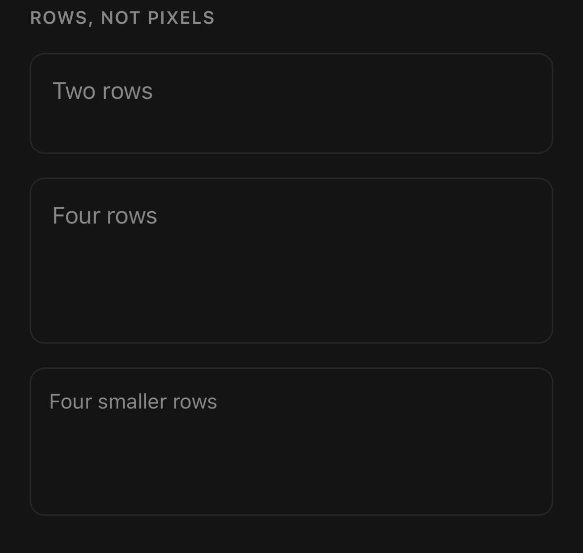
rows is how many lines of text the field is tall before it scrolls. It composes with size, so a small three-row field and a large three-row field are both three rows.
<Textarea rows={2} placeholder="Two rows" />
<Textarea rows={4} placeholder="Four rows" />
<Textarea size="sm" rows={4} placeholder="Four smaller rows" />
Growing with the text
autoGrow starts the field at rows and lets it follow the text up to maxRows, after which it holds its height and scrolls. It never shrinks below rows, so clearing the field returns it to where it started rather than collapsing it to one line.
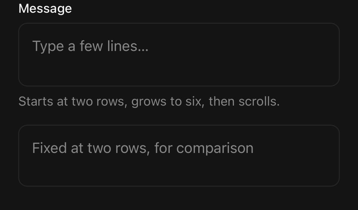
<Textarea
  autoGrow
  rows={2}
  maxRows={6}
  placeholder="Type a few lines…"
  value={message}
  onChangeText={setMessage}
/>
Label, description and error
Setting errorMessage also puts the field into its invalid state — you do not need a separate flag. The description is replaced by the error while one is present.
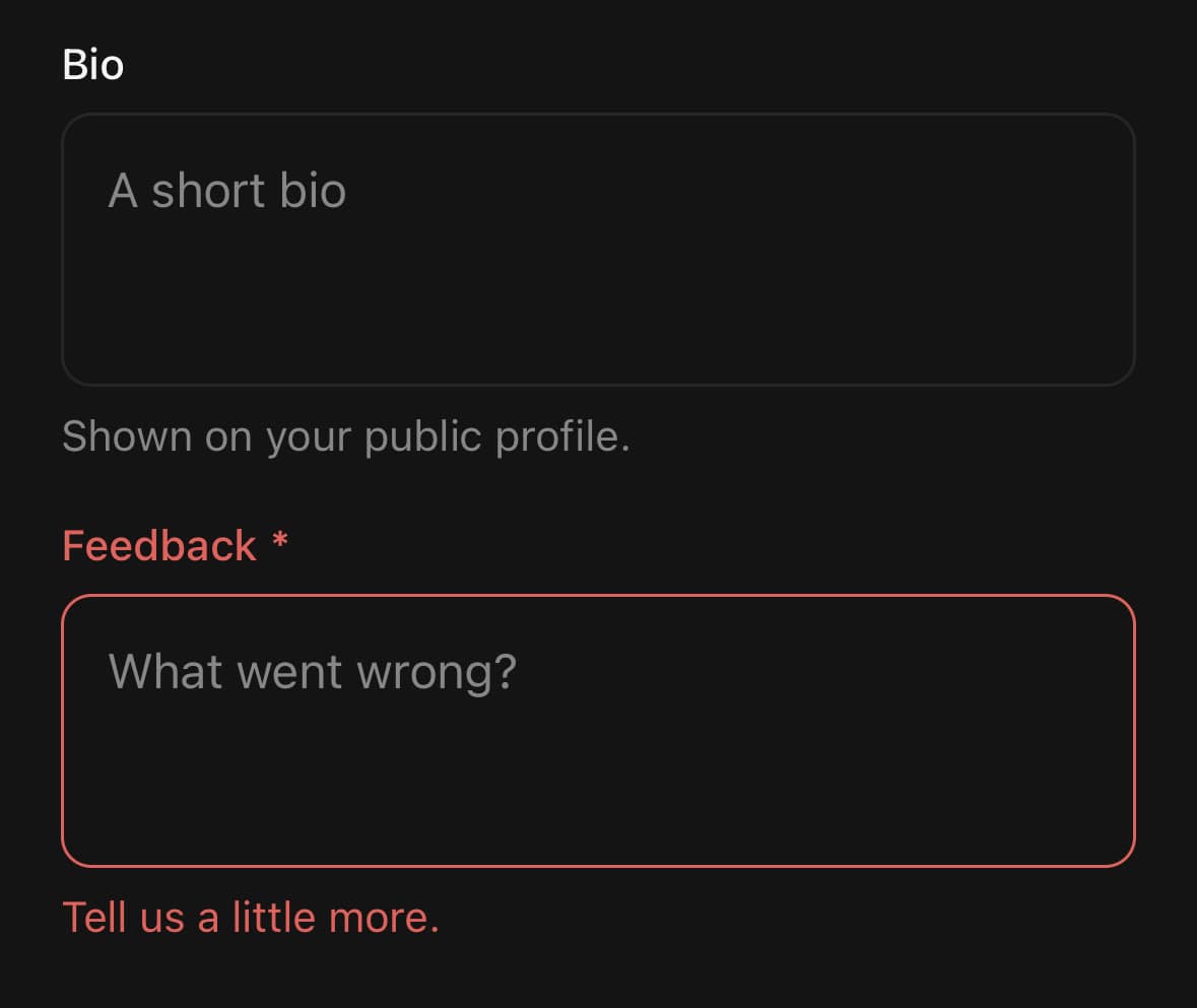
<Textarea
  label="Bio"
  placeholder="A short bio"
  description="Shown on your public profile."
/>

<Textarea
  label="Feedback"
  isRequired
  value={feedback}
  onChangeText={setFeedback}
  errorMessage="Tell us a little more."
/>
Counting characters
showCount needs maxLength to count towards. The counter sits beside the description and turns destructive at the limit.
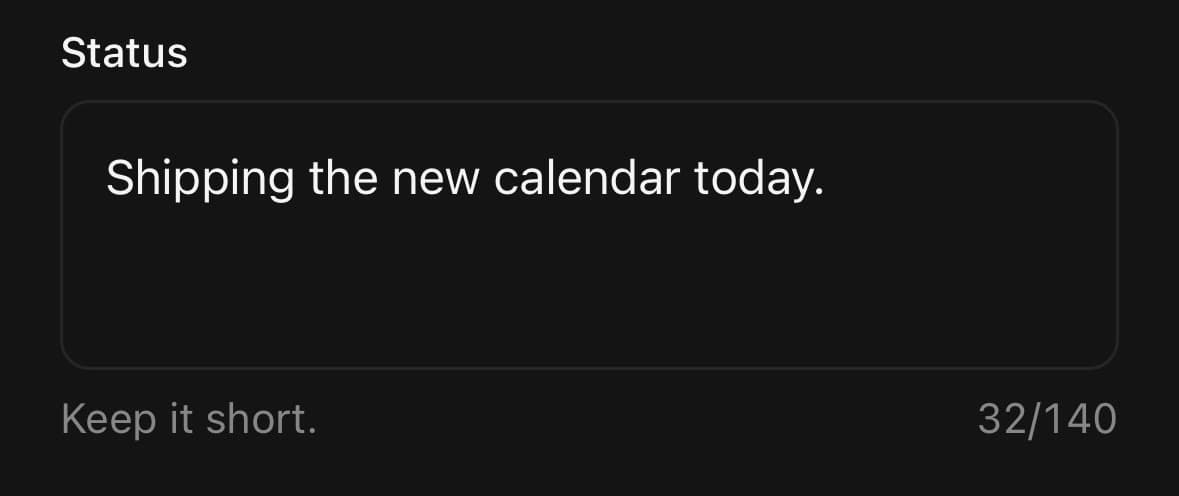
<Textarea
  label="Status"
  maxLength={280}
  showCount
  rows={3}
  description="Keep it short."
  value={status}
  onChangeText={setStatus}
/>
Choosing a background
Use outline on the page, where the field draws its own edge. Use filled inside a card or a sheet, where a second border beside the container’s own reads as a seam.
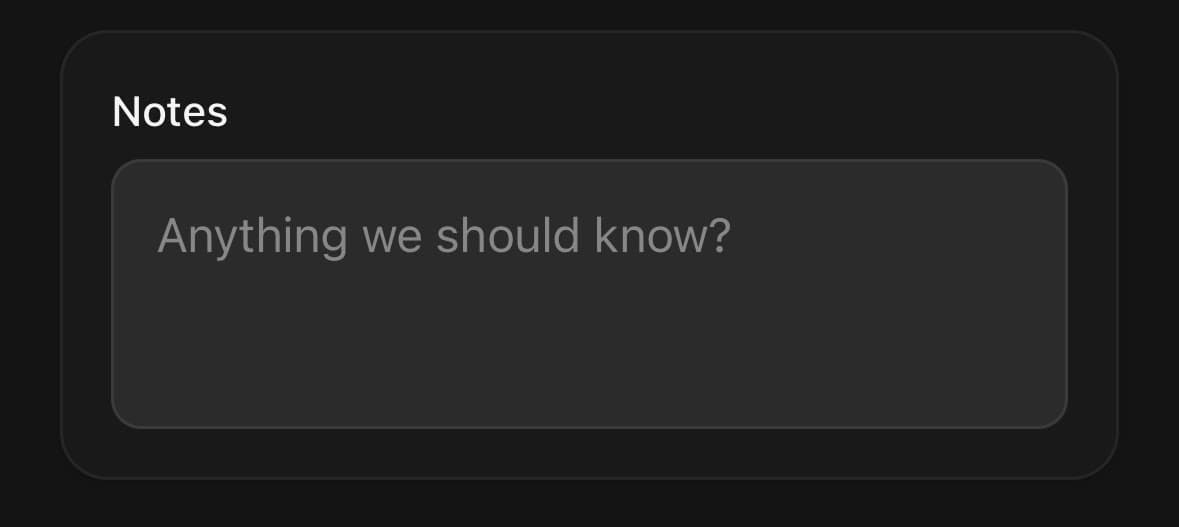
<Textarea label="Notes" placeholder="On the page" />

<Card>
  <Card.Content className="gap-4 p-4">
    <Textarea variant="filled" label="Notes" placeholder="In a card" />
  </Card.Content>
</Card>
Passing through TextInput props
Anything TextInput accepts works here, except multiline and numberOfLines — the component owns both.
<Textarea
  label="Address"
  rows={3}
  autoCapitalize="words"
  autoComplete="street-address"
  returnKeyType="done"
  submitBehavior="blurAndSubmit"
  onSubmitEditing={save}
/>
Versions
A composer that avoids the keyboard
A one-row composer that grows as the message does and rides the keyboard up. avoidKeyboard moves the field by exactly the amount the keyboard covers it, and autoGrow opens it up as the message gets longer — the pair of behaviours a chat input needs, and the one case a fixed box cannot show.
const insets = useSafeAreaInsets();

<KeyboardAvoider
  mode="dock"
  bottomInset={insets.bottom}
  className="absolute left-0 right-0 px-5"
  style={{ bottom: insets.bottom + 16 }}
>
  <View className="flex-row items-end gap-2 rounded-3xl border border-border bg-surface p-2">
    <Textarea
      autoGrow
      rows={1}
      maxRows={5}
      value={draft}
      onChangeText={setDraft}
      placeholder="Message"
      className="flex-1 border-0 bg-transparent px-2"
      containerClassName="flex-1"
    />
    <SendIcon size={18} />
  </View>
</KeyboardAvoider>
Variants
variant
outline(default)filled
{/* On the page, where the field draws its own edge. */}
<Textarea variant="outline" label="Notes" />

{/* Inside a card or a sheet, where a second border reads as a seam. */}
<Textarea variant="filled" label="Notes" />
size
smmd(default)lg
<Textarea size="sm" rows={3} placeholder="14px type" />
<Textarea size="md" rows={3} placeholder="16px type" />
<Textarea size="lg" rows={3} placeholder="16px type, roomier" />
API Reference
Textarea
| Prop | Type | Default | Description |
|---|---|---|---|
className | string | — | |
containerClassName | string | — | |
label | string | — | |
description | string | — | |
errorMessage | string | — | Error message. When set, the field renders in its invalid state. |
isRequired | boolean | — | Marks the field required — an asterisk on the label, and the a11y state. |
disabled | boolean | — | |
rows | number | 4 | How many lines of text the field is tall before it scrolls or grows. |
autoGrow | boolean | false | Grow with the text, one line at a time, up to maxRows — after which the field holds its height and scrolls instead. Without it the field stays at rows and scrolls from the first line past it. |
maxRows | number | 10 | The tallest autoGrow will go. Ignored without it. |
showCount | boolean | false | Show how much of maxLength is used, under the field. Needs maxLength; a counter with no limit to count towards says nothing. |
avoidKeyboard | boolean | false | Keep the field clear of the software keyboard. Moves by exactly the overlap, and not at all when the field is already clear — or when the keyboard belongs to a different field. The overlap is re-read every frame while the field is focused, so the field keeps its place in the page as it scrolls under and back out of the keyboard. Install react-native-keyboard-controller for this to behave on Android. Do not toggle this at runtime — it changes which component renders the container, which would remount the field and drop focus. |
keyboardMode | KeyboardAvoidanceMode | 'lift' | How the field gets clear. lift moves it up by its overlap and follows the scroll — right for a field in the flow of a page. dock makes it travel with the keyboard, for a composer already pinned near the bottom edge; pair it with keyboardBottomInset. |
keyboardOffset | number | 16 | Gap kept between the field and the keyboard. keyboardMode="lift" only. |
keyboardBottomInset | number | 0 | How far above the bottom edge the field already sits — usually the safe area inset. keyboardMode="dock" only. |
Every part also accepts the underlying React Native props (ViewProps or TextProps) and a className for Tailwind utilities.
Notes
Accepts every TextInputProps except multiline and numberOfLines, both of which the component owns — it is always multiline, and its height comes from rows. disabled cannot be undone with the inherited editable prop. Passing editable={false} also applies the disabled styling and announced state, so the visual, native and accessibility contracts cannot disagree.
The height is computed rather than set as a class. A row count only becomes a height once you know how tall a line is, so the type size, its leading and the vertical padding are kept as numbers per size and the box is derived from them. Setting a line height in a class as well would give you two numbers that disagree.
autoGrow measures the text through onContentSizeChange and clamps the result between rows and maxRows. The field never shrinks below rows, so a field that has been typed into and cleared goes back to the height it started at rather than collapsing to one line.
showCount needs maxLength — a counter with no limit to count towards says nothing. It sits on the same row as the description, right-aligned, and turns destructive once the limit is reached.
errorMessage puts the field in its invalid state, the same as it does on Input: the border is tinted at rest as well as on focus, because the error is a fact about the value rather than about whether the field happens to be focused.
avoidKeyboard behaves exactly as it does on Input — it moves the field by its overlap with the keyboard and re-reads that overlap every frame while the field is focused. Do not toggle it at runtime; it changes which component renders the container, which would remount the field and drop focus.
Public exports
Values: Textarea
Types: TextareaProps