

CodeBlock
A fenced snippet, syntax-coloured and scrolled sideways.
A fenced snippet, syntax-coloured and scrolled sideways.
Code does not wrap. Wrapping a line puts the continuation under the indentation and the two stop meaning different things, so the body scrolls horizontally instead — which on a phone is the only honest way to show a ninety-column line.
The highlighter ships inside the component: one pass of regex over the languages a chat actually streams, with no grammar, no worker and no dependency. Colours come from the theme's --color-code-* tokens.
Installation
CodeBlock ships with the library — no separate install.
import { CodeBlock, Message } from 'panelui-native';Or copy the source into your project, to own and edit it:
npx panelui-cli@latest add code-blockUsage
<CodeBlock code={code} language="tsx">
  <CodeBlock.Header>
    <CodeBlock.Filename>calendar.tsx</CodeBlock.Filename>
    <CodeBlock.CopyButton />
  </CodeBlock.Header>
</CodeBlock>
Composition
<CodeBlock>
  <CodeBlock.Header>…</CodeBlock.Header>
  <CodeBlock.Filename>…</CodeBlock.Filename>
  <CodeBlock.Language>…</CodeBlock.Language>
  <CodeBlock.Actions>…</CodeBlock.Actions>
  <CodeBlock.CopyButton>…</CodeBlock.CopyButton>
</CodeBlock>CodeBlock.Header— The bar above the code: what the file is, and what can be done with it.CodeBlock.Filename— The file's name, in monospace.CodeBlock.Language— The language, for a block with no filename to name it by.CodeBlock.Actions— A row for the buttons at the trailing edge of the header.CodeBlock.CopyButton— Copies the block's code and ticks for two seconds. Needsexpo-clipboard.
Examples
A snippet with a header
code and language are the whole of it; everything in children is drawn above the code. A block with no children is just the code.
<CodeBlock code={snippet} language="tsx">
  <CodeBlock.Header>
    <CodeBlock.Filename>calendar.tsx</CodeBlock.Filename>
    <CodeBlock.Actions>
      <CodeBlock.CopyButton />
    </CodeBlock.Actions>
  </CodeBlock.Header>
</CodeBlock>
Numbered lines
showLineNumbers puts a gutter down the leading edge, sized to the longest line number so the code does not shift as the block passes ten or a hundred lines.
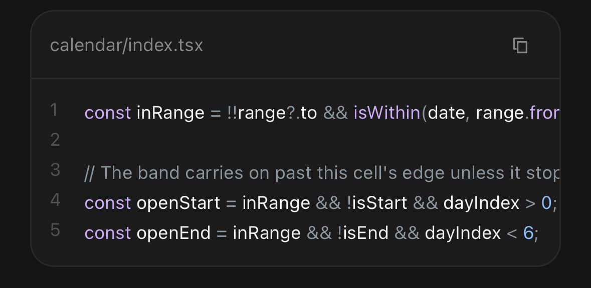
<CodeBlock showLineNumbers code={snippet} language="ts" />The languages it colours
ts, tsx, js, jsx, json, bash, python, css, html, sql, markdown and diff, along with the usual spellings of each — typescript, sh, py, md. Anything else renders as clean monospace rather than as a guess.
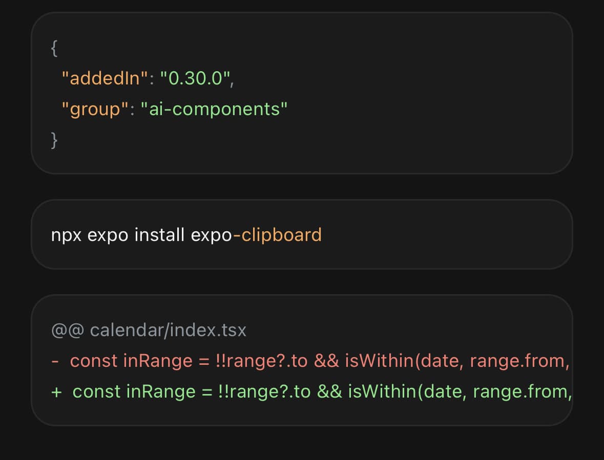
<CodeBlock code={json} language="json" />
<CodeBlock code={install} language="bash" />
<CodeBlock code={patch} language="diff" />

{/* Not recognised — plain monospace, and no guessing. */}
<CodeBlock code={config} language="nginx" />
In a turn
Inside the bubble's content rather than beside it: a snippet is something the model said. Give the bubble no padding of its own where a code block is the whole of the turn, or the block ends up inset twice.
<Message align="start">
  <Message.Content>
    <Message.Bubble>
      <Message.BubbleContent>
        Here is the fix:
      </Message.BubbleContent>
    </Message.Bubble>
    <CodeBlock code={patch} language="diff">
      <CodeBlock.Header>
        <CodeBlock.Language>diff</CodeBlock.Language>
        <CodeBlock.CopyButton />
      </CodeBlock.Header>
    </CodeBlock>
  </Message.Content>
</Message>
API Reference
CodeBlock
| Prop | Type | Default | Description |
|---|---|---|---|
className | string | — | |
code | string | — | The snippet. |
language | string | — | What it is written in. ts, tsx, js, jsx, json, bash, python, css, html, sql, markdown and diff are coloured, along with the usual spellings of each; anything else renders as plain monospace. |
showLineNumbers | boolean | false | Number the lines in a gutter down the leading edge. |
CodeBlock.Header
| Prop | Type | Default | Description |
|---|---|---|---|
className | string | — |
CodeBlock.Filename
| Prop | Type | Default | Description |
|---|---|---|---|
className | string | — |
CodeBlock.Language
| Prop | Type | Default | Description |
|---|---|---|---|
className | string | — |
CodeBlock.Actions
| Prop | Type | Default | Description |
|---|---|---|---|
className | string | — |
CodeBlock.CopyButton
| Prop | Type | Default | Description |
|---|---|---|---|
className | string | — | |
timeout | number | — | How long the tick stays up before turning back into the copy glyph. |
onCopy | () => void | — |
Every part also accepts the underlying React Native props (ViewProps or TextProps) and a className for Tailwind utilities.
Notes
The highlighter is deliberately small. A real tokenizer is a grammar per language, which is megabytes and a worker — the wrong shape twice over here, because a chat renders fragments rather than files and the fragments arrive a token at a time, so whatever runs has to run again on every frame of a stream.
What it therefore does not do: nested languages, template-literal interpolation, or anything needing a parser to know. A block comment spanning several lines is coloured only on its first, because each line is tokenized on its own so that a stream which has just gained a character does not re-tokenize the whole block. What it does do is make a keyword look like a keyword, which is the whole of the value in a twelve-line snippet.
A line is one Text with coloured runs inside it, not a row of views. Only inside a single Text do the runs share a baseline and keep the spaces between them; a row of views gives every token its own box and the line comes apart at the seams.
Colours are theme tokens. --color-code-keyword, -string, -number, -comment, -function, -property, -punctuation, -inserted and -deleted are declared per theme and per light/dark. Override them after the theme import to put a snippet on your own palette.
Copying needs expo-clipboard. It is an optional peer, and the button is silent without it:
npx expo install expo-clipboardPublic exports
Values: CodeBlock, resolveLanguage
Types: CodeBlockProps, CodeBlockHeaderProps, CodeBlockFilenameProps, CodeBlockLanguageProps, CodeBlockActionsProps, CodeBlockCopyButtonProps, CodeLanguage, Token, TokenKind