

Timeline
A sequence of events, vertical or swiped sideways.
A sequence of events, vertical by default.
value marks how far along the sequence is; tone colours an individual event by kind, independently of that progress.
orientation="horizontal" lays the items out as columns on a rail wider than the screen, swiped through rather than scrolled down. Reach for it when the span is long enough that read downwards it becomes a page nobody finishes.
A horizontal timeline scrolls off the side, and that is what buys each column its width. An item carrying content takes a readable column; an item carrying none collapses to a tick, so a quiet stretch of years compresses instead of paying full width for nothing. Give Timeline.Item a width to override that.
Installation
Timeline ships with the library — no separate install.
import { Timeline, Avatar } from 'panelui-native';
import { View } from 'react-native';
Or copy the source into your project, to own and edit it:
npx panelui-cli@latest add timelineUsage
<Timeline variant="icon" value={2}>
  {events.map((event, index) => (
    <Timeline.Item
      key={event.title}
      step={index}
      tone={event.tone}
      last={index === events.length - 1}
    >
      <Timeline.Aside>
        <Timeline.Date>{event.time}</Timeline.Date>
        <Timeline.Label>{event.team}</Timeline.Label>
      </Timeline.Aside>
      <Timeline.Indicator>
        <ShieldCheckIcon size={15} />
      </Timeline.Indicator>
      <Timeline.Content>
        <Timeline.Header>
          <Timeline.Title>{event.title}</Timeline.Title>
          <Timeline.Trailing>{event.at}</Timeline.Trailing>
        </Timeline.Header>
        <Timeline.Description>{event.body}</Timeline.Description>
      </Timeline.Content>
    </Timeline.Item>
  ))}
</Timeline>
Composition
<Timeline>
  <Timeline.Item step={0}>
    <Timeline.Aside>
      <Timeline.Date>…</Timeline.Date>
      <Timeline.Label>…</Timeline.Label>
      <Timeline.Meta>…</Timeline.Meta>
    </Timeline.Aside>
    <Timeline.Indicator>…</Timeline.Indicator>
    <Timeline.Content>
      <Timeline.Header>
        <Timeline.Title>…</Timeline.Title>
        <Timeline.Trailing>…</Timeline.Trailing>
      </Timeline.Header>
      <Timeline.Stats>
        <Timeline.Stat label="…" value="…" />
      </Timeline.Stats>
      <Timeline.Description>…</Timeline.Description>
    </Timeline.Content>
  </Timeline.Item>
</Timeline>

<Timeline.Masthead media={…} label="…" title="…" />

<Timeline orientation="horizontal">
  <Timeline.Item step={0}>
    <Timeline.Aside>
      <Timeline.Meta>…</Timeline.Meta>
      <Timeline.Date>…</Timeline.Date>
    </Timeline.Aside>
    <Timeline.Indicator />
    <Timeline.Content>
      <Timeline.Description>…</Timeline.Description>
    </Timeline.Content>
  </Timeline.Item>
</Timeline>Timeline.List— See props below.Timeline.Item— One event.stepis its position,laststops the connector.Timeline.Aside— Right-aligned meta column left of the rail. Place it before the indicator. Horizontal, it draws into the band the column already reserves above the rail and takes no height of its own — so it is optional, and a column without one still puts its tick on the line.Timeline.Masthead— The block above a horizontal rail, saying what the run of columns is:media(a logo pair, an avatar stack), thenlabel, thentitle. It sits outside theTimelinebecause it belongs to the whole run rather than to any column, and a horizontalTimelinelays out nothing but columns. The two lines are typeset as one unit — the label a size below the title and muted, with tight leading — which a pair ofTexts written at the call site is not.Timeline.Indicator— The node on the rail, with the connector below it. Horizontal, it is a tick on the shared rail and takes no children.Timeline.Content— Everything right of the rail — and everything below it when the timeline runs sideways, where it fades further than the column around it as that column leaves the reading edge.Timeline.Header— Title row: heading left, trailing slot right.Timeline.Heading— Wraps a title and anything stacked under it inside the header row.Timeline.Date— Timestamp, usually in the aside.Timeline.Label— Category line, coloured by the item's tone.Timeline.Meta— Muted supporting line — a person, a source.Timeline.Title— Event heading.Timeline.Trailing— Right-hand slot in the header row.Timeline.Description— Body text.Timeline.Stats— Bordered strip of label/value pairs.Timeline.Stat— One label/value pair insideStats.
Examples
An activity feed
value is the index of the current entry; earlier ones render as completed.
<Timeline value={2}>
  <Timeline.Item step={0}>
    <Timeline.Aside><Timeline.Indicator /></Timeline.Aside>
    <Timeline.Content>
      <Timeline.Header>
        <Timeline.Title>Order placed</Timeline.Title>
        <Timeline.Date>Mon 09:14</Timeline.Date>
      </Timeline.Header>
      <Timeline.Description>Payment authorised.</Timeline.Description>
    </Timeline.Content>
  </Timeline.Item>

  <Timeline.Item step={1}>
    {/* … */}
  </Timeline.Item>

  <Timeline.Item step={2} last>
    {/* `last` drops the connector below the final entry. */}
  </Timeline.Item>
</Timeline>
Tone per entry
Tone is set on the item, not the root, so one failed step can stand out in an otherwise ordinary run.
<Timeline.Item step={3} tone="danger">
  <Timeline.Aside><Timeline.Indicator /></Timeline.Aside>
  <Timeline.Content>
    <Timeline.Title>Build failed</Timeline.Title>
    <Timeline.Description>3 tests failed on node 20.</Timeline.Description>
  </Timeline.Content>
</Timeline.Item>
Numbered and card variants
{/* Numbers instead of dots — for ordered procedures. */}
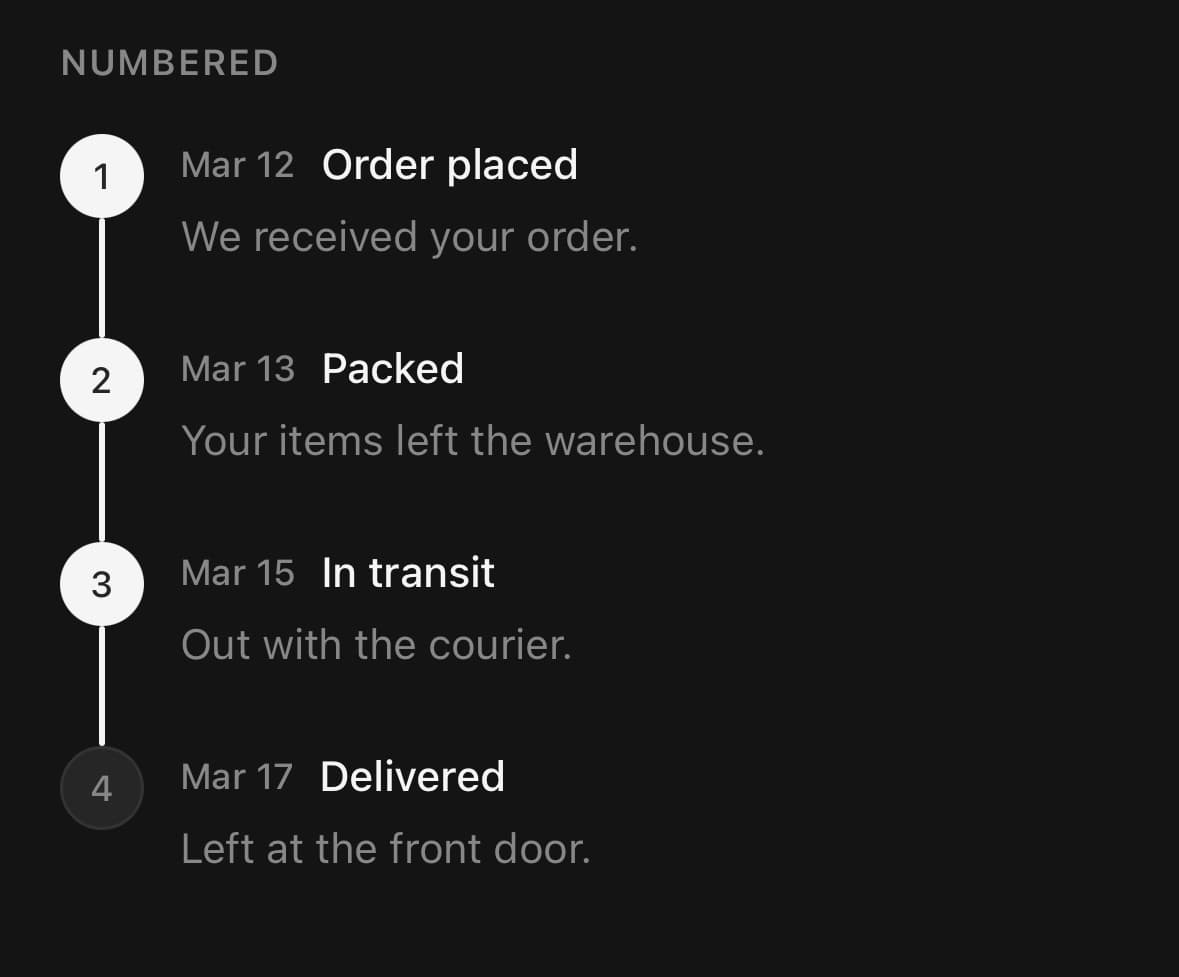
<Timeline variant="numbered">{/* …items… */}</Timeline>

{/* Each entry on its own surface. */}
<Timeline variant="card">{/* …items… */}</Timeline>

{/* Tighter rows for long histories. */}
<Timeline variant="compact">{/* …items… */}</Timeline>
With stats
<Timeline.Content>
  <Timeline.Title>Deployed</Timeline.Title>
  <Timeline.Stats>
    <Timeline.Stat label="Duration" value="1m 42s" />
    <Timeline.Stat label="Region" value="fra1" />
  </Timeline.Stats>
</Timeline.Content>
A long virtualized history
Only the native FlatList window mounts. Return a Timeline.Item and let the list own its positional props.
<Timeline.List
  data={events}
  value={currentIndex}
  keyExtractor={(event) => event.id}
  itemWidth={(event) => event.details ? 268 : 76}
  renderItem={({ item }) => (
    <Timeline.Item tone={item.tone}>
      <Timeline.Aside><Timeline.Date>{item.date}</Timeline.Date></Timeline.Aside>
      <Timeline.Indicator />
      <Timeline.Content>
        <Timeline.Title>{item.title}</Timeline.Title>
        <Timeline.Description>{item.details}</Timeline.Description>
      </Timeline.Content>
    </Timeline.Item>
  )}
/>
Versions
A working life, sideways
Stops on a rail wider than the screen. The quiet years carry the argument: they collapse to a tick, so a stretch with nothing on it costs a thumb-width instead of a screen and the years that did something keep their room. Nothing sets a width — the columns take it from whether they have content.
onColumnChange is what makes the masthead move with the rail: it reports which column the reading edge is on, and the marks, the label and the name all come from that column. It fires on the crossing rather than per frame, so it is one state update per column.
Nothing is written above the rail per column. The masthead says where you are, once — a year printed over every tick as well is the same fact twice, and the smaller copy is the one nobody can read.
const [active, setActive] = useState(0);
const entry = stops[active];

return (
  <>
    <Timeline.Masthead
      className="px-5 pb-8"
      media={
        <>
          <Avatar size="md" fallback={entry.initials} />
          <View className="-ms-3">{entry.mark}</View>
        </>
      }
      label={entry.label}
      title={entry.title}
    />

    <Timeline
      orientation="horizontal"
      haptics
      value={stops.length - 1}
      onColumnChange={setActive}
      className="pl-5"
    >
      {stops.map((stop, index) => (
        <Timeline.Item key={stop.year} step={index} last={index === stops.length - 1}>
          <Timeline.Indicator />
          <Timeline.Content>
            {stop.events.map((event) => (
              <Timeline.Description key={event} className="pb-3">
                {event}
              </Timeline.Description>
            ))}
          </Timeline.Content>
        </Timeline.Item>
      ))}
    </Timeline>
  </>
);
Variants
variant
dot(default)iconnumberedcardcompact
<Timeline variant="dot">…</Timeline>
<Timeline variant="icon">…</Timeline>
<Timeline variant="numbered">…</Timeline>
<Timeline variant="card">…</Timeline>
<Timeline variant="compact">…</Timeline>
tone
default(default)infosuccesswarningdanger
{/* Tone is per entry, not per timeline. */}
<Timeline.Item step={0} tone="default">…</Timeline.Item>
<Timeline.Item step={1} tone="info">…</Timeline.Item>
<Timeline.Item step={2} tone="success">…</Timeline.Item>
<Timeline.Item step={3} tone="warning">…</Timeline.Item>
<Timeline.Item step={4} tone="danger">…</Timeline.Item>
orientation
vertical(default)horizontal
{/* Vertical is the default. Horizontal scrolls off the side of the screen. */}
<Timeline orientation="vertical">…</Timeline>
<Timeline orientation="horizontal">…</Timeline>
API Reference
Timeline
| Prop | Type | Default | Description |
|---|---|---|---|
className | string | — | |
value | number | 0 | Steps at or below this index render as completed. |
variant | TimelineVariant | dot | |
orientation | TimelineOrientation | vertical | Which way the sequence runs. horizontal lays the items out as columns on a rail wider than the screen, swiped through rather than scrolled down. |
snap | boolean | true | Horizontal only: land a flick on a column rather than between two. On by default, because the thing being moved between is a column — stopping halfway shows two half-columns and no whole one. |
haptics | boolean | false | Horizontal only: a tick as the reading edge passes from one column to the next. Needs snap, since a scroll that lands anywhere has no detents to feel. Off by default — a haptic per column is a lot for a long history, and whether this one is worth feeling is the caller's call. |
onColumnChange | (index: number) => void | — | Horizontal only: which column is at the reading edge, reported as it changes. For anything outside the rail that belongs to the column being read — a masthead naming it, a caption, a picture. Without it that block can only show the same thing for the whole run, which makes a swipe through ten columns a swipe under one unchanging heading. The index is the column's position among the rendered items, not its step: step is the progress value and may be sparse or repeated, so it cannot address a column. It fires on the crossing, not per frame — the reading edge passing from one column to the next — so it is a state update per column rather than per scroll event. |
Timeline.List
| Prop | Type | Default | Description |
|---|---|---|---|
data | readonly T[] | — | Complete event collection; rows outside the native window stay unmounted. |
renderItem | (info: ListRenderItemInfo<T>) => ReactElement<TimelineItemProps> | — | Render one Timeline.Item. Its step, width, and last marker are owned by the list. |
itemWidth | number | ((item: T, index: number) => number) | — | Width of each column, or a resolver for mixed-width histories. |
value | number | 0 | Steps at or below this index render as completed. |
variant | TimelineVariant | 'dot' | |
snap | boolean | true |
Timeline.Item
| Prop | Type | Default | Description |
|---|---|---|---|
className | string | — | |
step | number | — | Position in the sequence, zero-based. |
completed | boolean | false | Force the completed state regardless of the timeline's value. |
tone | TimelineTone | default | Colours the node and label — for event kind rather than progress. |
last | boolean | false | Set on the final item so its rail stops at the indicator. |
width | number | — | Horizontal only: how wide this column is, in points. Left out, a column that carries content takes a readable width and one that carries none collapses to a tick — so a quiet stretch of the sequence compresses instead of paying full width for nothing. Set it to override that for a column that needs more or less room than its contents suggest. It must be finite and greater than zero; invalid values use the content default. |
Timeline.Indicator
| Prop | Type | Default | Description |
|---|---|---|---|
className | string | — |
Timeline.Stat
| Prop | Type | Default | Description |
|---|---|---|---|
className | string | — | |
label | string | — | |
value | string | 0 |
Timeline.Masthead
| Prop | Type | Default | Description |
|---|---|---|---|
className | string | — | |
media | ReactNode | — | What sits above the two lines — a logo pair, an avatar stack, a single mark. Anything; the slot only lays it out in a row. |
label | string | — | The small line: what kind of thing the run below is. |
title | string | — | The name of it, in the size the eye lands on first. |
Every part also accepts the underlying React Native props (ViewProps or TextProps) and a className for Tailwind utilities.
Notes
In a horizontal timeline, snapping and focus follow the rendered Timeline.Item order. step remains the semantic progress value, so it may be sparse, repeated, or reordered without moving another column’s snap point; non-item children do not create phantom offsets.
Colour follows one rule: progress is solid, event kind is tinted. An untoned step runs from muted to primary as the timeline advances, exactly as Steps does; a toned step takes that tone's soft fill with its contents in the matching foreground. The dot and card variants keep full saturation — they are 16px discs with nothing inside, and a soft tint at that size disappears.
Icons inside Timeline.Indicator inherit a colour that reads against the node, so they stay legible in every theme without a hardcoded value.
Horizontal
Timeline.Masthead goes above the rail — outside the Timeline, because a horizontal one lays out columns and the masthead belongs to the run rather than to any one of them. Media, then a small label, then the name.
Pair it with onColumnChange to make it follow the drag: the timeline reports which column the reading edge is on, and the masthead shows that column's. Without it a swipe through ten columns is a swipe under one unchanging heading.
The band above the rail is reserved by the column, so Timeline.Aside is optional — a column with nothing above the rail still puts its tick on the line.
The rail is drawn once across the whole track and every column puts a tick on it. What keeps those ticks on one line is that the band above the rail is a fixed height, reserved by the column itself — so Timeline.Aside draws into it rather than being what creates it, and a taller label cannot push one column's tick below its neighbours'.
A flick lands on a column rather than between two, which is what snap is for; turn it off for free scrolling.
A column drops four points and scales down four percent as it leaves the reading edge, and its date, age and description run from the muted token to the foreground one as it arrives — the same colour a heading uses. Position alone made the focused column nearer and no easier to read than its neighbours; colour is what says which one you are on.
The colour is driven by scroll position, not by a clock, so it is not disabled under reduced motion — the reader's own finger is what moves it. What that setting drops is the scale and the drop.
haptics adds a tick as the reading edge passes from one column to the next. It needs snap, since a scroll that lands anywhere has no detents to feel, and it is off by default: a haptic per column is a lot for a long history.
With the operating system set to reduce motion both curves are dropped and the rail simply scrolls.
Timeline.Indicator takes no children here: the node is a tick on the rail, not a disc with an icon in it, and variant does not change that.
Consumer style values compose around the horizontal item's measured width and scroll-driven fade rather than replacing them. A custom width must be finite and greater than zero; invalid values fall back to the same wide-or-narrow content default used when width is omitted.
For long horizontal histories, use Timeline.List. It uses React Native FlatList with a bounded native render window while the original compound Timeline API remains available for short or arbitrary mixed compositions. renderItem returns a Timeline.Item; the list owns its step, width, and last props so layout, progress, snapping, and item identity cannot disagree. itemWidth may be one number or a per-event resolver and must return a finite positive value.
Public exports
Values: Timeline
Types: TimelineProps, TimelineItemProps, TimelineIndicatorProps, TimelineStatProps, TimelineVariant, TimelineTone, TimelineOrientation