

Planner
A month of days, each carrying what falls on it.
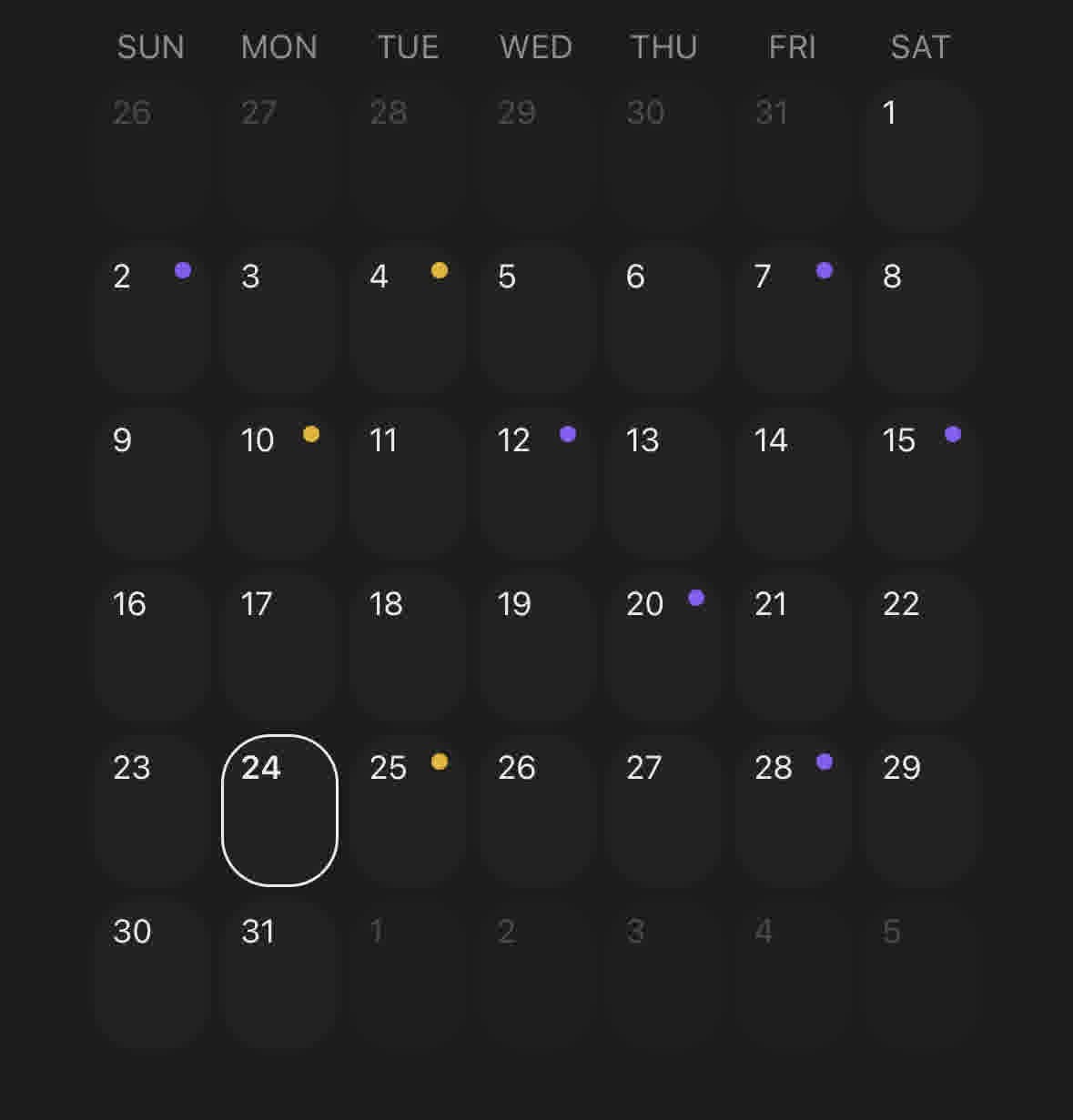
A month grid where every day carries what falls on it — a marker, an icon, and a count you can hear. Pressing a day opens what is on it.
It is not a date picker. Calendar exists to choose a date and answer with one; Planner shows what is already on the days, and its selection exists to open something rather than to be submitted. Reach for Calendar when the answer is a date, and for Planner when the date is the question.
The grid is always six weeks. A month spans five or six depending on the weekday it starts on, and drawn at its natural height the panel changes size as you page through the year — which makes the days appear to move under your thumb.
Installation
Planner ships with the library — no separate install.
import { Planner, Text, Button, Item } from 'panelui-native';Or copy the source into your project, to own and edit it:
npx panelui-cli@latest add plannerUsage
const [month, setMonth] = useState(new Date());

<Planner
  month={month}
  onMonthChange={setMonth}
  entries={renewals}
  categories={[
    { id: 'monthly', label: 'Monthly' },
    { id: 'yearly', label: 'Yearly' },
  ]}
>
  <Planner.Header>
    <Planner.Title />
    <Planner.Today />
    <Planner.Nav />
  </Planner.Header>
  <Planner.Grid />
  <Planner.Legend />
</Planner>
Composition
<Planner entries={entries} categories={categories}>
  <Planner.Header>
    <Planner.Title />
    <Planner.Today />
    <Planner.Nav />
    <Planner.Action>{/* a button of yours */}</Planner.Action>
  </Planner.Header>
  <Planner.Grid />           {/* or <Planner.Scroller /> */}
  <Planner.Legend>
    <Planner.Summary />
  </Planner.Legend>
  <Planner.Footer>{/* tools that act on the month */}</Planner.Footer>
  <Planner.Details>{(date, entries) => /* … */}</Planner.Details>
</Planner>
Header has to be a direct child of Planner. The root sorts its children so the header lands in the frame's top strip and everything else in the panel, which is what makes one widget out of two places.
Details is optional. Leaving it out does not disable selection — onDayPress still fires, which is what a planner that pushes a screen instead of opening a dialog wants.
Examples
A month of renewals
The ordinary case. Entries in any order, two categories, and the legend that reads them.
const [month, setMonth] = useState(new Date(2026, 0));

<Planner
  month={month}
  onMonthChange={setMonth}
  entries={[
    { id: 'n', date: new Date(2026, 0, 2), label: 'Netflix', category: 'monthly' },
    { id: 'a', date: new Date(2026, 0, 7), label: 'Adobe', category: 'monthly' },
    { id: 'f', date: new Date(2026, 0, 10), label: 'Figma', category: 'yearly' },
  ]}
  categories={[
    { id: 'monthly', label: 'Monthly' },
    { id: 'yearly', label: 'Yearly' },
  ]}
>
  <Planner.Header>
    <Planner.Title />
    <Planner.Today />
    <Planner.Nav />
  </Planner.Header>
  <Planner.Grid />
  <Planner.Legend counts>
    <Planner.Summary />
  </Planner.Legend>
</Planner>
Opening a day
Details binds a dialog to the open day. The planner owns the binding; what the dialog says is yours, because the contents of a day are your data.
<Planner entries={entries} categories={categories}>
  <Planner.Header>
    <Planner.Title />
    <Planner.Nav />
  </Planner.Header>
  <Planner.Grid />
  <Planner.Details>
    {(date, dayEntries) =>
      dayEntries.length === 0 ? (
        <Text muted size="sm">Nothing on this day.</Text>
      ) : (
        dayEntries.map((entry) => (
          <Item key={entry.id}>
            <Item.Content>
              <Item.Title>{entry.label}</Item.Title>
            </Item.Content>
          </Item>
        ))
      )
    }
  </Planner.Details>
</Planner>
Pushing a screen instead
Leave Details out and handle onDayPress yourself. The selection still moves, so the day you opened stays marked while you are away from it.
<Planner
  entries={entries}
  categories={categories}
  onDayPress={(date, dayEntries) => {
    router.push(`/day/${date.toISOString().slice(0, 10)}`);
  }}
>
  <Planner.Header>
    <Planner.Title />
    <Planner.Nav />
  </Planner.Header>
  <Planner.Grid />
</Planner>
Icons in the cells
An entry's icon is drawn in its day. entryLimit caps how many a cell draws before it counts the rest — raise it for a wide screen, drop it to 0 for a grid of markers alone.
<Planner
  entries={[
    { id: 'n', date: new Date(2026, 0, 2), label: 'Netflix', category: 'monthly', icon: <Avatar size="xs" source={netflix} /> },
    { id: 'f', date: new Date(2026, 0, 28), label: 'Figma', category: 'monthly', icon: <Avatar size="xs" source={figma} /> },
  ]}
  categories={[{ id: 'monthly', label: 'Monthly' }]}
  entryLimit={1}
>
  <Planner.Header>
    <Planner.Title />
    <Planner.Nav />
  </Planner.Header>
  <Planner.Grid />
</Planner>
Without the frame
For a planner inside a sheet, a dialog or a card that already draws its own boundary.
<BottomSheet open={open} onOpenChange={setOpen}>
  <BottomSheet.Content>
    <Planner frame={false} entries={entries} categories={categories}>
      <Planner.Grid />
      <Planner.Legend />
    </Planner>
  </BottomSheet.Content>
</BottomSheet>
A cell of your own
renderDay replaces the cell entirely. It is handed the day, what falls on it, and the three states the default cell draws from — so a custom cell does not have to work them out again.
<Planner entries={entries} categories={categories}>
  <Planner.Header>
    <Planner.Title />
    <Planner.Nav />
  </Planner.Header>
  <Planner.Grid
    renderDay={({ date, entries, isToday, isInMonth }) => (
      <View className={cn('m-0.5 flex-1 rounded-lg p-1', isToday && 'bg-primary/10')}>
        <Text size="xs" muted={!isInMonth}>{date.getDate()}</Text>
        {entries.length > 0 ? <Text size="xs">{entries.length}</Text> : null}
      </View>
    )}
  />
</Planner>
A month of icons
variant="tiles" gives each day over to the one thing on it. The entry's icon is drawn large and centred, its color tints the tile, and the date moves into the corner.
Days either side of the month are left blank in this look.
<Planner
  variant="tiles"
  entries={[
    { id: 'n', date: new Date(2026, 0, 3), label: 'Netflix', color: '#e50914', icon: <Image source={netflix} style={{ width: 26, height: 26, borderRadius: 6 }} /> },
    { id: 's', date: new Date(2026, 0, 8), label: 'Spotify', color: '#1db954', icon: <Image source={spotify} style={{ width: 26, height: 26, borderRadius: 6 }} /> },
  ]}
>
  <Planner.Header>
    <Planner.Title />
    <Planner.Today />
    <Planner.Nav />
  </Planner.Header>
  <Planner.Grid />
</Planner>
A year you can scroll
Scroller replaces Grid with the weeks of the year in one list, and calendar names every entry in its day.
It fills its container, so give it a parent with a height.
const [day, setDay] = useState<Date | null>(null);

<View className="flex-1">
  <Planner
    fill
    variant="calendar"
    frame={false}
    selected={day}
    onSelectedChange={setDay}
    entries={schedule}
    categories={categories}
  >
    <Planner.Header>
      <Planner.Title />
      <Planner.Today />
      <Planner.Nav />
    </Planner.Header>
    <Planner.Scroller />
  </Planner>
</View>
Lifecycle contract
| Case | Contract |
|---|---|
| default initialization | defaultMonth and defaultSelected initialize their uncontrolled owners once. |
| controlled acceptance | Month and selection requests render after their owner supplies them. |
| controlled rejection | Rejected requests leave the accepted month and selection visible. |
| external reset | Owner month, selection, and null resets render without request callbacks. |
| disabled path | Not applicable: Planner has no root disabled contract; consumers disable actions individually. |
| prop replacement | Equivalent Date instances retain semantic month identity; distinct instants replace it. |
| unmount cleanup | Lifecycle hooks retain no timers or subscriptions; today refresh owns separate cleanup. |
| reduced motion | Not applicable: lifecycle state commits do not animate. |
| callback counts | Each normalized request reports once; prop acceptance and reset report zero times. |
Executable evidence: packages/panelui/test/planner-lifecycle.test.mjs (5 tests).
Variants
inMonth
true(default)false
<Planner inMonth>…</Planner>
<Planner inMonth={false}>…</Planner>
variant
default(default)tilescalendar
<Planner variant="default">…</Planner>
<Planner variant="tiles">…</Planner>
<Planner variant="calendar">…</Planner>
API Reference
Planner
| Prop | Type | Default | Description |
|---|---|---|---|
className | string | — | |
month | Date | — | The month on show. Leave it out for an uncontrolled planner. |
defaultMonth | Date | — | |
onMonthChange | (month: Date) => void | — | |
entries | PlannerEntry[] | [] | Everything the planner knows about, in any order and any month. |
categories | PlannerCategory[] | [] | The colour key. Declaration order is legend order and palette order. |
selected | Date | null | — | The open day. null is none. Leave it out for an uncontrolled planner. |
defaultSelected | Date | null | null | |
onSelectedChange | (date: Date | null) => void | — | |
onDayPress | (date: Date, entries: PlannerEntry[]) => void | — | Runs before the selection moves, whether or not Details is present. |
variant | PlannerVariant | default | What each day draws. tiles is one large icon per day, tinted by its category; calendar names every entry and needs the height to do it. |
fill | boolean | false | Stretch the grid to its container instead of standing at its own height. For a planner that owns a screen — the six weeks share out whatever is left after the header, the legend and anything below them. |
entryLimit | number | — | How many entries a cell draws before it counts the rest. Default 2, or 3 under calendar, which has the room; tiles draws one whatever you pass. |
weekStartsOn | number | 'auto' | 'auto' | First day of the week, 0 is Sunday. Defaults to the locale's. |
locale | DateLocale | — | |
calendar | CalendarSystem | 'gregory' | |
frame | boolean | true | Draw the surrounding Frame. Off for a planner in a sheet or a card. |
Planner.Nav
| Prop | Type | Default | Description |
|---|---|---|---|
className | string | — |
Planner.Grid
| Prop | Type | Default | Description |
|---|---|---|---|
className | string | — | |
renderDay | PlannerDayRenderer | — | Draws a cell yourself. It is handed the day and what falls on it. |
Planner.Day
| Prop | Type | Default | Description |
|---|---|---|---|
date | Date | — | |
renderDay | PlannerDayRenderer | — |
Planner.Legend
| Prop | Type | Default | Description |
|---|---|---|---|
className | string | — | |
counts | boolean | — | Print each category's count for the month beside its label. |
Planner.Footer
| Prop | Type | Default | Description |
|---|---|---|---|
className | string | — |
Planner.Details
| Prop | Type | Default | Description |
|---|---|---|---|
className | string | — | |
title | ReactNode | — | Title above the children. Defaults to the day's full date. |
description | ReactNode | — | The line under the title. Defaults to how many entries the day carries, so the dialog answers "how much of this is there" before it is read. Pass null to drop it. |
Planner.Scroller
| Prop | Type | Default | Description |
|---|---|---|---|
className | string | — | |
weeks | number | 53 | How many weeks either side of the opening month can be reached. Default 53, about a year each way. |
rowHeight | number | 96 | The height of one week row. Default 96. |
renderDay | PlannerDayRenderer | — | Draws a cell yourself. It is handed the day and what falls on it. |
Every part also accepts the underlying React Native props (ViewProps or TextProps) and a className for Tailwind utilities.
Notes
Entries and categories
An entry is { id, date, label }, plus an optional category and icon. Pass the whole set at once, in any order and across any months; the planner indexes the set once by day, then month changes inspect only the fixed 42-cell grid. Cell entry nodes remain bounded by 42 × entryLimit, while counts and spoken labels still include every entry.
A category is the key to a colour. Categories take their dot from the --color-chart-* tokens in the order they are declared, so they follow the theme into dark mode — give one a colorIndex to pick a different token, or a color for a brand that is not the theme's to choose.
Today, and the day you opened
Today rings its tile; the day you open fills it. They are two different marks because they answer two different questions — which day it is now, and which day the details below belong to — and a day that is both keeps the ring over the fill. Planner refreshes that ring at local midnight while it stays open, and refreshes again when the app returns from the background.
The ring is drawn in the foreground colour, so it reads as a plain outline against the tile in either theme. Every cell reserves the ring's width whether it draws one or not, so nothing shifts by a point at the moment it is picked.
What a day draws, and what it says
A cell draws up to entryLimit icons — two by default — and then a count of what is left. It is one marker dot per day rather than one per entry: a cell that fits a row of dots does not also fit the date.
The marker carries its meaning in colour, and colour is a signal that does not reach every reader. So the legend prints its label beside every swatch, and a day is spoken as its date, how many entries it carries and which categories they belong to — "16 January 2026, 3 entries: Monthly, Yearly". Between them those two are the whole content of the grid for somebody who cannot see it.
The weekday headings are hidden from screen readers. Each day already names its own weekday, and React Native has no per-cell grid vocabulary to fall back on — no gridcell, no row — so a day has to be self-contained, and reading the heading again over 42 cells only makes it longer.
On the web, one day is in the Tab order. Arrow Left/Right moves one visible day, Arrow Up/Down one week, and Home/End reaches the first or last day in the rendered week; movement stops at the six-week grid boundary. Enter and Space use the day button's ordinary press action. Native and TV keep every day as an ordinary Pressable so the platform focus engine owns directional movement. A custom renderDay also owns its own focus and activation behavior.
Using the month navigation announces the new month after it is shown. Mounting the planner and changing a controlled month prop directly stay silent, so an ordinary parent render does not interrupt what somebody is already reading. A controlled navigation request is announced only if the parent accepts it on the next committed render.
What a cell draws
variant decides it, and a cell can only give one answer:
default— the date, a marker dot, and up toentryLimiticons under it.tiles— the day given over to one large icon, the tile tinted with its colour, and the date small in the corner.calendar— every entry named in a block of its colour, under a centred date, on an open grid ruled off by week.
An entry can carry its own color. It wins over its category's, and it is what a brand wants: a logo belongs to the thing rather than to the group it was filed under, and a set of them would otherwise need one category per row.
tiles leaves the days either side of the month blank. There is no tile, nothing to press and nothing read out, because a faded tile only invites the press it is going to ignore. Only the weeks the month actually spans are drawn, and they share out the height six weeks would have taken — so a five-week month has slightly taller tiles than a six-week one, and neither leaves a band of empty space or changes the size of the panel.
calendar needs height for its labels. Give it fill inside a flex-1 parent, or use Scroller, which sets its own row height.
An entry with no colour of any kind is drawn plain rather than tinted. The colour says what kind of thing is on the day; a day with no answer to that is better left alone than coloured for the sake of it.
Paging, and scrolling
Grid is a month at a time: six weeks, moved through with Nav, which is what a planner sharing a screen with something else wants.
Scroller is the weeks of the year in one list. Use it when the question is what is coming rather than what this month looks like — the week straddling a month boundary is then drawn once, in one piece, instead of appearing cut in half at the bottom of one page and again at the top of the next.
The range is bounded, at weeks either side of the month it opened on — about a year each way by default. A scroller has to know its own height to place a scrollbar and to reach a month without rendering its way there, and neither is possible over a list with no end.
The header follows the scroll. Whichever month holds most of the first week on screen is the one named, and the days either side of it grey out. Nav and Today still work; they scroll the list rather than replacing what is in it. A scroll never announces the month it arrives at — that would talk over somebody reading the weeks — while Nav and Today still do, because those are deliberate.
entryLimit caps what a cell draws. It defaults to 2, or 3 under calendar, which has the room; tiles draws one whatever you pass. Past the limit calendar prints an ellipsis rather than a count: the cell has already run out of room, and a row spent on "+2 more" is a row not spent on an entry.
Filling a screen
fill stretches the weeks to their container instead of standing them at their own height. It needs a height to fill — inside a scroll view there is none, and the grid collapses — so put a fill planner in a flex-1 parent.
The frame
The root draws its own Frame: a month at a glance wants a boundary, a strip carrying the month and the way through it, and a footer that holds still while the middle changes. Pass frame={false} for a planner inside a sheet or a card that already draws its own edge.
Public exports
Values: Planner
Types: PlannerProps, PlannerEntry, PlannerCategory, PlannerHeaderProps, PlannerTitleProps, PlannerTodayProps, PlannerNavProps, PlannerActionProps, PlannerGridProps, PlannerScrollerProps, PlannerVariant, PlannerDayProps, PlannerDayState, PlannerDayRenderer, PlannerLegendProps, PlannerSummaryProps, PlannerFooterProps, PlannerDetailsProps, PlannerCountedCategory