

Dialog
Modal dialog with a backdrop and footer actions.
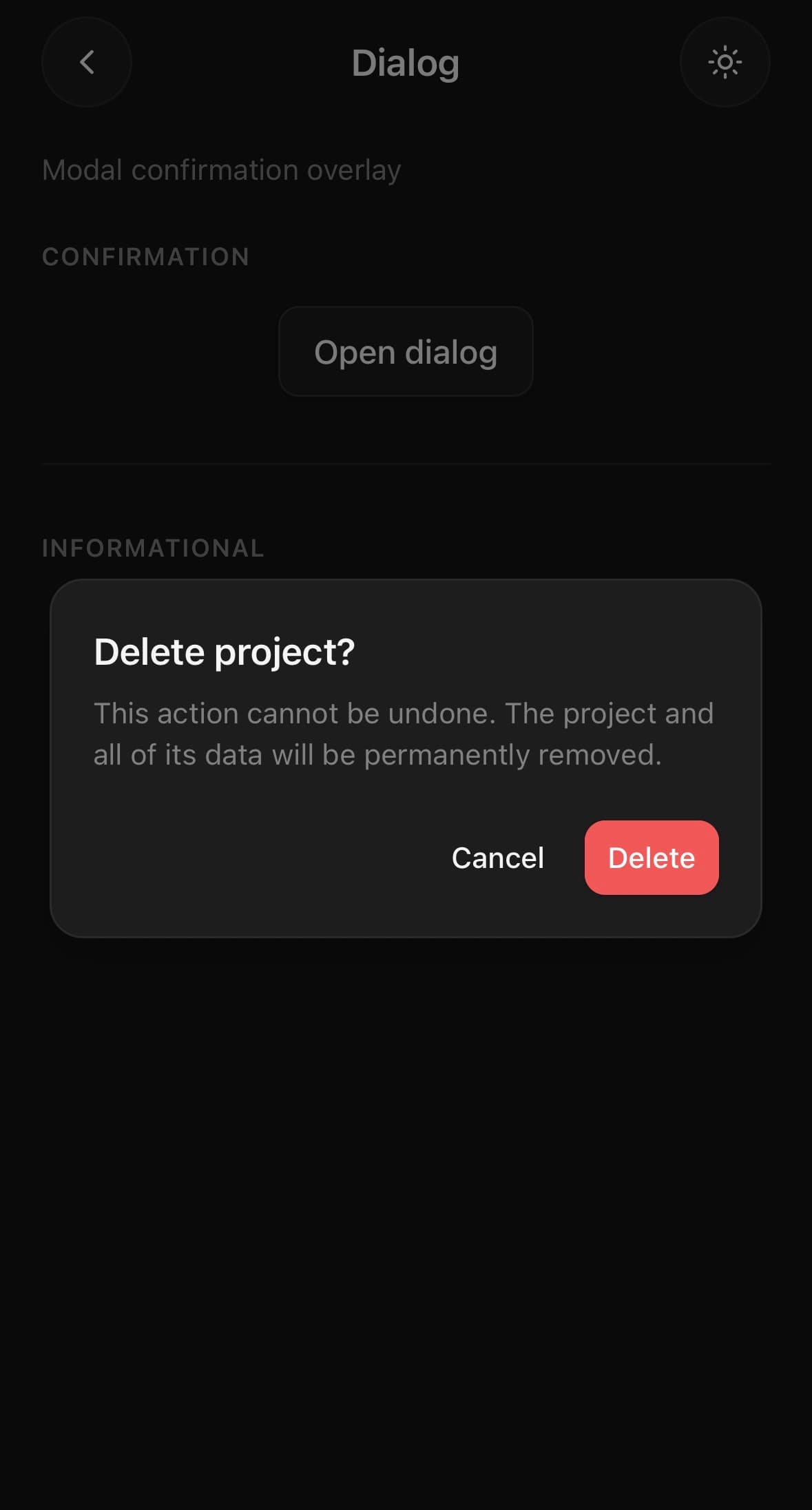
A modal dialog with a backdrop and footer actions.
It mounts through a portal and unmounts after its exit animation.
Use it when the reader has to deal with something before carrying on. When the surrounding context needs to stay visible, use Popover; on a phone, a BottomSheet is usually the better shape for anything with more than two lines in it.
Installation
Dialog ships with the library — no separate install.
import { Dialog, Button, Input } from 'panelui-native';
import { View } from 'react-native';
Or copy the source into your project, to own and edit it:
npx panelui-cli@latest add dialogUsage
<Dialog>
  <Dialog.Trigger>
    <Button variant="outline">Delete</Button>
  </Dialog.Trigger>
  <Dialog.Content>
    <Dialog.Title>Delete project?</Dialog.Title>
    <Dialog.Description>
      This action cannot be undone.
    </Dialog.Description>
    <Dialog.Footer>
      <Dialog.Close>
        <Button size="sm" variant="ghost">Cancel</Button>
      </Dialog.Close>
      <Dialog.Close>
        <Button size="sm" variant="destructive">Delete</Button>
      </Dialog.Close>
    </Dialog.Footer>
  </Dialog.Content>
</Dialog>
Composition
<Dialog>
  <Dialog.Trigger>…</Dialog.Trigger>
  <Dialog.Content>
    <Dialog.Title>…</Dialog.Title>
    <Dialog.Description>…</Dialog.Description>
    <Dialog.Footer>
      <Dialog.Close>…</Dialog.Close>
    </Dialog.Footer>
  </Dialog.Content>
</Dialog>Dialog.Trigger— Clones its child and opens the dialog on press.Dialog.Content— The dialog surface, rendered in a portal.Dialog.Title— Required for accessibility.Dialog.Description— Supporting text.Dialog.Footer— Row of actions, aligned to the trailing edge.variant="panel"draws it as a band instead — a rule across the top, a step darker, and the dialog's own bottom corners, bleeding out through the dialog's padding to reach its edges.Dialog.Close— Clones its child and closes the dialog on press.
Examples
Uncontrolled, with a trigger
<Dialog>
  <Dialog.Trigger>
    <Button variant="outline">Rename</Button>
  </Dialog.Trigger>
  <Dialog.Content>
    <Dialog.Title>Rename project</Dialog.Title>
    <Dialog.Description>This is visible to everyone on the team.</Dialog.Description>
    <Input className="mt-4" defaultValue={project.name} />
    <Dialog.Footer>
      <Dialog.Close>
        <Button variant="ghost">Cancel</Button>
      </Dialog.Close>
      <Button onPress={save}>Save</Button>
    </Dialog.Footer>
  </Dialog.Content>
</Dialog>
Controlled confirmation
dismissible={false} forces a deliberate choice — the backdrop no longer closes it.
const [open, setOpen] = useState(false);

<Dialog open={open} onOpenChange={setOpen}>
  <Dialog.Content dismissible={false}>
    <Dialog.Title>Delete 12 files?</Dialog.Title>
    <Dialog.Description>This cannot be undone.</Dialog.Description>
    <Dialog.Footer>
      <Button variant="ghost" onPress={() => setOpen(false)}>Cancel</Button>
      <Button variant="destructive" onPress={confirm}>Delete</Button>
    </Dialog.Footer>
  </Dialog.Content>
</Dialog>
A blurred background
Pass blur to frost the screen behind the dialog instead of dimming it. It uses expo-blur when installed and falls back to the dim when it is not.
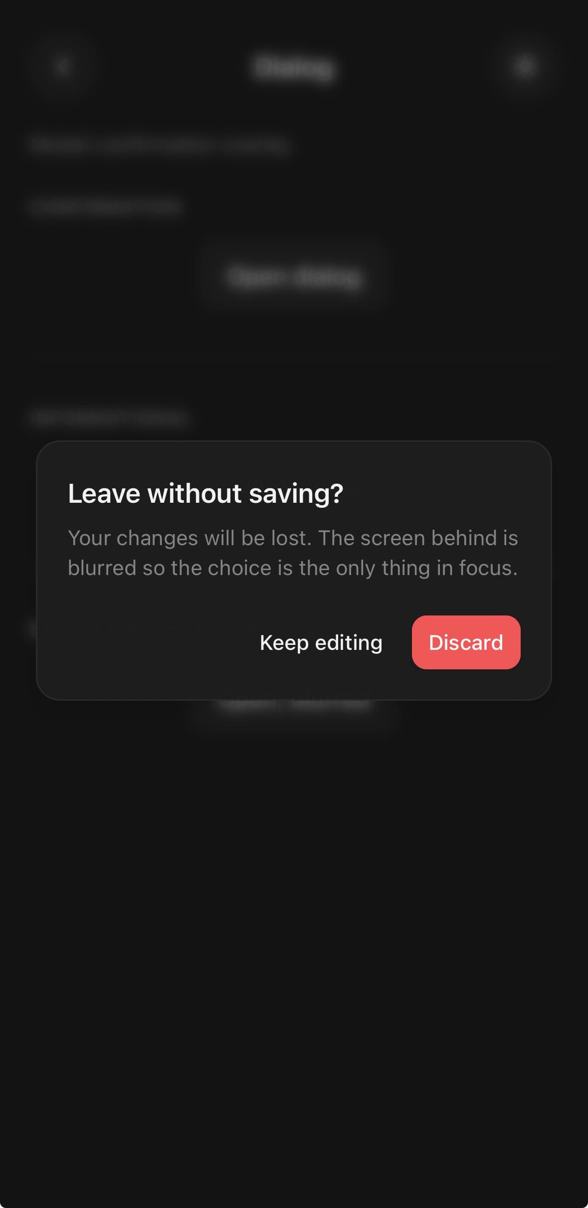
<Dialog>
  <Dialog.Trigger>
    <Button variant="outline">Discard changes</Button>
  </Dialog.Trigger>
  <Dialog.Content blur>
    <Dialog.Title>Leave without saving?</Dialog.Title>
    <Dialog.Description>Your changes will be lost.</Dialog.Description>
    <Dialog.Footer>
      <Dialog.Close><Button size="sm" variant="ghost">Keep editing</Button></Dialog.Close>
      <Dialog.Close><Button size="sm" variant="destructive">Discard</Button></Dialog.Close>
    </Dialog.Footer>
  </Dialog.Content>
</Dialog>
Actions on their own surface
variant="panel" separates what the dialog says from what you can do about it.
Worth it on a dialog with a form in it, where the buttons are otherwise the last row of the form. A dialog that only asks a question does not need it — there is nothing there for the band to divide.
<Dialog>
  <Dialog.Trigger>
    <Button variant="outline">Edit profile</Button>
  </Dialog.Trigger>
  <Dialog.Content>
    <Dialog.Title>Edit profile</Dialog.Title>
    <Dialog.Description>Make changes to your profile here.</Dialog.Description>
    <View className="gap-4 py-4">
      <Input label="Name" defaultValue="Pedro Duarte" />
      <Input label="Username" defaultValue="@peduarte" />
    </View>
    <Dialog.Footer variant="panel">
      <Dialog.Close>
        <Button size="sm" variant="outline">Cancel</Button>
      </Dialog.Close>
      <Dialog.Close>
        <Button size="sm">Save changes</Button>
      </Dialog.Close>
    </Dialog.Footer>
  </Dialog.Content>
</Dialog>
Variants
variant
plain(default)panel
<Dialog variant="plain">…</Dialog>
<Dialog variant="panel">…</Dialog>
API Reference
Dialog
| Prop | Type | Default | Description |
|---|---|---|---|
open | boolean | — | Controlled open state. |
onOpenChange | (open: boolean) => void | — | |
defaultOpen | boolean | — | Initial state when uncontrolled. |
Dialog.Content
| Prop | Type | Default | Description |
|---|---|---|---|
className | string | — | |
dismissible | boolean | true | Tap on the backdrop closes the dialog. Default true. |
blur | boolean | false | Frost the screen behind the dialog instead of dimming it. Uses expo-blur when installed and falls back to the dim when it is not, so it is safe to pass either way. Someone who has Reduce Transparency switched on gets an opaque backdrop instead, which is the whole point of the setting. |
Dialog.Footer
| Prop | Type | Default | Description |
|---|---|---|---|
className | string | — |
Every part also accepts the underlying React Native props (ViewProps or TextProps) and a className for Tailwind utilities.
Notes
Focus after closing
On the web, closing returns keyboard focus to the element that had it before the overlay opened. Nested overlays return to the still-open parent first. If that element was removed or disabled while the overlay was open, it is skipped rather than focusing a stale control. Native screen-reader containment remains the platform's accessibilityViewIsModal behaviour.
Public exports
Values: Dialog
Types: DialogProps, DialogContentProps